Molnify Feature Reference
Introduction
This is the complete Molnify Feature Reference. It covers the various components of a Molnify application and how to customize them for your application. This document is intended for intermediate or advanced users and will not guide you on how to build your first Molnify application.
To get started with Molnify, see one of the following resources:
- Creating a Molnify application, which explains how to quickly and easily create a Molnify application from scratch.
- Molnify video tutorials, which introduce the basics of Molnify. Additional video tutorials on developing Molnify applications are also available at Molnify's YouTube channel.
Some other useful resources and tools are:
- Molnify example applications, with Excel sheets available to download from each example application.
- The CSS-generator, which helps you generate and experiment with stylings of your app.
Throughout this reference, boxed text such as this one contains more in-depth and technical details.
API connection
In addition to using the http action to communicate with external APIs, each Molnify application has an API. The Molnfiy application's API allows your systems to e.g. use your application to perform calculations. Contact us for more information about how you can access your Molnify application through its API.
Database Connection
You can connect your Molnify application to an SQL database.
- You can follow our guide on how to use the database for your app
- Alternatively, you can contact us to have us assist you in setting up your database.
Once your database is enabled, you can:
- Perform database lookups using the Database Lookup macro.
- Insert rows into your database table using the Insert Row action.
- Use Autofill to populate your app with data from a database table.
- Save inputs to your database, and restore them, using the Add Record action.
Single-Sign-On (SSO)
Molnify supports multiple types of sign-on: email/password, Google based, Azure AD, TokenAuthentication (described below) and SAML-based logins. Contact us to enable SSO for your domain(s).
Token Authentication
The purpose of TokenAuthentication is so that you as a client of Molnify can easily log in your customer to Molnify applications, without having to go through the process of having your users creating accounts on Molnify or alternatively integrate with your SSO solutions (e.g., Google Domains or Microsoft Active Directory). An app can be enabled for token-based authentication by specifying the metadata TokenAuthentication.
For more information, contact us.
Structure
Molnify turns a spreadsheet into an app containing different elements: inputs, outputs, charts, tables and actions. In short, inputs let the user fill in data, while outputs, charts and tables show results. Actions are used to perform tasks such as sending emails and much more. The colors of your spreadsheet cells tell Molnify what types of elements to create.
The basic structure for an input and output consists of three cells: (1) title, (2) value and (3) user interface (UI string). The UI string decides how an input or output is presented and is optional. If left out, Molnify will choose the most appropriate representation.
Colors
Use these colors to let Molnify know what types of elements to create.
- Green (#00b050): Inputs
- Red (#ff0000): Outputs
- Light blue (#0070c0): Charts and Tables
- Yellow (#ffff00): Actions
- Purple (#7030a0): Metadata
You can use other spreadsheet-editors than Excel and Google Sheets to create your Molnify application, but you need to use the hex values of the standard colours for Excel and Google sheets.
| A | B | C | D | E | |
|---|---|---|---|---|---|
| 1 | Value A | 5 | A Chart | Series | |
| 2 | Value B | 10 | Value A | =B1 | |
| 3 | Value B | =B2 | |||
| 4 | Product | =B1*B2 | |||
| 5 | |||||
| 6 | Name | My App | |||
| 7 | ID | myApp |
This would create a fully functional app with two inputs (Value A and Value B) with default values of 5 and 10. An output box, titled Product, would show the product of the two inputs. A chart, titled A Chart, would plot the two inputs. The purple cells set the metadata; i.e., the name would be My App and its ID would be myApp.
User Interface (UI) String
To customize an input or output, you may specify different settings
in the cell to the right of the actual input/output (cell C1 in the example). We call this
the UI (user interface) string. All these options are
separated by ;. E.g., min=0;max=50.
| A | B | C | |
|---|---|---|---|
| 1 | Label | 0 | min=0;max=50 |
This example would generate a numeric input titled Label with a default value of 0. Its UI string is min=0;max=50, so only values between 0 and 50 would be allowed.
It is important that there are no blankspaces in the UI string, in order for it to be parsed correctly.
Inputs
If you color a cell green, you will get an input. There are many different types of inputs, such as text fields, sliders, dropdown menus and more.
An input consists of the following elements:
- Title: Specify the title of the input to the left.
- The actual input: The green cell in the middle contains the actual input element. Any value or result of formula present in this cell will determine the default value of this input. Additionally, if the UI string does not specify which kind of input the element is, then Molnfiy will choose a type of input based on the default value of this cell.
- UI string: The cell to the right contains UI options for the input.
- Tooltip: Add a comment to the title cell (the green cell) to make Molnify show a tooltip when you hover over the title of the input.
Example:

| A | B | C | |
|---|---|---|---|
| 1 | Label | 0 | min=0;max=50 |
This example would generate a numeric input titled Label with a default value of 0. Its UI string is min=0;max=50, so only values between 0 and 50 would be allowed.
Any formulas present in input value cells are only calculated when the application is loaded, to generate default values for inputs.
Afterwards, they are not re-calculated when the state of the application changes, e.g. when the value of another input changes, to avoid
overriding any data already filled in by the user.
In other words, to dynamically change the default value of an input, you need to use e.g. javascript to work around this limitation.
Button Group
By having data validation enabled for an input cell and assigning a list of values, Molnify will show a group of buttons - one for each value in the list. If the list contains more than 5 options, Molnify will present a dropdown list instead.
Example:

| A | B | C | |
|---|---|---|---|
| 1 | Select Country | Sweden | select |
This example would create an input titled Select Country with a default value of Sweden. Its UI string is select, which would tell Molnify to show this as a button group regardless of the length of the data validation list.
The button group input supports the following UI strings: class, dividerName, hidden, JSOnChange, NOCALC, resetWhenHidden, select, variable.
See also: Dropdown list.
Date-picker
An input field can be rendered as a date-picker by formatting the input cell as a date in your spreadsheet.
Alternatively, you may instruct Molnify to interpret the cell as a date-picker by specifying
date in the UI string.
Example:

| A | B | C | |
|---|---|---|---|
| 1 | Date | 2020-01-01 | date |
This example would create a datepicker titled Date with a default value of 2020-01-01. Its UI string is date.
The date-picker input supports the following UI strings: date (required), class, dividerName, hidden, JSOnChange, NOCALC, variable.
See also: Time-picker.
Dropdown list
By having data validation enabled for an input cell and assigning a list of values, Molnify will show a dropdown list - one for each value in the list. If the list contains 5 or fewer options, Molnify will present a button group instead.
Example:

| A | B | C | |
|---|---|---|---|
| 1 | Select Country | Sweden | dropdown |
This example would create an input titled Select Country with a default value of Sweden. Its UI string is dropdown, which would tell Molnify to show this as a dropdown menu regardless of the length of the data validation list.
The dropdown list input supports the following UI strings: class, dividerName, dropdown, hidden, JSOnChange, multiple, NOCALC, variable.
See also: Button group, Row Dropdown, Record Dropdown.
File Upload
A file upload input lets your users upload files. Referencing
the input (e.g., =B1) will give you a comma-separated string of URLs to
the uploaded files. E.g.,
https://files.myserver.com/files/anImage.jpg,https://files.myserver.com/files/anotherImage.jpg.
If you need to retrieve a full-sized image, add __full_ to the filename, e.g.,
.../anImage__full_.jpg.
Next to the file upload area is a gallery of the uploaded files associated with the specific input.
Optionally, you may limit the number of uploaded files by using the maxFiles UI string, e.g. maxFiles=10;. Similarly, you may limit the accepted file types by using the acceptedFileTypes UI string, see acceptedFileTypes for more information.
Example:
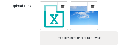
| A | B | C | |
|---|---|---|---|
| 1 | Upload Files | fileUpload;maxFiles=10 |
This example would create an input titled Upload Files. Its UI string is fileUpload;maxFiles=10, which would tell Molnify to create a file upload area and gallery. It would allow for a maximum of ten files to be uplodad.
The file upload input supports the following UI strings: fileUpload (required), acceptedFileTypes, class, dividerName, hidden, JSOnChange, maxFiles, NOCALC, variable.
Infotext
An infotext is actually not an input, but a descriptive text placed among your inputs. For longer infotext, you may use the long infotext instead.
As input cells do not re-calculate any formula present in their value cell, infotext inputs cannot be used to create dynamic text contents. To create a dynamic text that is displayed among inputs, use a HTML output among inputs instead.
Example:

| A | B | C | |
|---|---|---|---|
| 1 | Description | This may be... | infoText |
This would create an info text with the title Description and the text This may be.... Its UI string, infoText, tells Molnify to render it as an info text.
The infotext input supports the following UI strings: infotext (required), class, dividerName, hidden, variable.
See also: Long Infotext, HTML output.
Long Infotext
A long infotext is actually not an input, but a descriptive text placed among your inputs. Wider than the regular Infotext input, the long infotext does not show a title, but instead uses the space where the title would have been as additional space to display its value.
As input cells do not re-calculate any formula present in their value cell, long infotext inputs cannot be used to create dynamic text contents. To create a dynamic text that is displayed among inputs, use an HTML output among inputs instead.
Example:

| A | B | C | |
|---|---|---|---|
| 1 | This may be long... | longInfoText |
This would create a long info text with the text This may be long.... Note that long info texts do not have titles. Its UI string, longInfoText, tells Molnify to render it as a long info text.
The long infotext input supports the following UI strings: longinfotext (required), class, dividerName , hidden, variable.
See also: Infotext, HTML output.
Manager
A manager cell will contain TRUE or FALSE, depending on if the signed in user is a manager or not.
The manager supports the following UI strings: manager (required).
Numeric text field
Text fields are the default input types. A text field becomes a numeric text field when the default value is numeric.
Example:
| A | B | C | |
|---|---|---|---|
| 1 | Label | 0 | min=0;max=50 |
This example would generate a numeric input titled Label with a default value of 0. Its UI string is min=0;max=50, so only values between 0 and 50 would be allowed.
The numeric text field supports the following UI strings: class, dividerName, hidden, JSOnChange, max, min, noButtons, NOCALC, postFix, preFix, regEx, variable.
See also: Text area, Text field.
Record Dropdown
A dropdown input whose options are rows from the app's record table. When the user selects a row, all columns that match app input variable names are automatically populated — equivalent to loading a record. This is the "read" counterpart of the Add Record action.
Access control is enforced automatically using the app's RecordTableAccessColumn metadata. The table, ID column, and access column default to the app's metadata (RecordTableName, RecordTableIdVariable, RecordTableAccessColumn) but can be overridden per dropdown.
Like the row dropdown, the display option supports & concatenation and SQL expressions.
| A | B | C | |
|---|---|---|---|
| 1 | Load Record | recorddropdown;display=customerName |
A dropdown whose options are rows from the app's record table. When the user selects a row, all columns that match app input variable names are automatically populated. Access control is enforced via the app's RecordTableAccessColumn metadata. This example uses the app's default record table and displays the customerName column.
The record dropdown input supports the following UI strings: accessColumn, class, display, dividerName, hidden, JSOnChange, maxRows, NOCALC, orderBy, recorddropdown, recordTableIdVariable, recordTableName, variable.
See also: Row Dropdown, Dropdown list.
Row Dropdown
A dropdown input whose options are rows fetched from a database table. When the user selects a row, column values are mapped to app variables. This is the "read" counterpart of the Insert Row action.
The dropdown fetches data from the specified table each time it is opened. A search field allows the user to filter results.
Filters support @variable syntax to reference current input values, e.g. filter=country = @selectedCountry.
The display option supports Excel-style & concatenation as a shortcut for CONCAT().
For example, display=firstName&' '&lastName is equivalent to display=CONCAT(firstName,' ',lastName).
You can also use SQL expressions directly, e.g. display=COALESCE(name,'(unnamed)').
| A | B | C | |
|---|---|---|---|
| 1 | Select Customer | rowdropdown; tableName=customers; display=name; map=name->custName |
A dropdown whose options are rows from a database table. When the user selects a row, the mapped columns are written to the specified app variables. This example queries the customers table, displays the name column, and maps it to the app variable custName.
The row dropdown input supports the following UI strings: class, display, dividerName, filter, hidden, idVariable, JSOnChange, map, maxRows, NOCALC, orderBy, rowdropdown, tableName, variable.
See also: Record Dropdown, Dropdown list.
Signature
This input provides a signature area for hand-written signatures.
Example:

| A | B | C | |
|---|---|---|---|
| 1 | Sign Here | signature |
This would create a signature input with the title Sign Here. Its UI string, signature, tells Molnify to render it as a signature area.
The data format of a signature is Base30. To access this data as SVG instead, see copySVGToTextInput.
The signature supports the following UI strings: signature (required), class, dividerName, hidden, JSOnChange, NOCALC, variable.
See also: copySVGToTextInput.
Slider
A slider is a numeric input which is shown as a slider. The slider may have either a single handle, or two if enabled by the range ui-string.
Example:
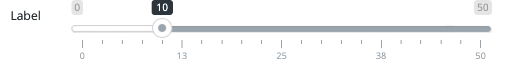
| A | B | C | |
|---|---|---|---|
| 1 | Label | 10 | slider;min=0;max=50 |
This example would create a slider titled Label with a default value of 10. Its UI string is slider;min=0;max=50, which tells Molnify to present this as a slider with a range of 0-50.
The slider supports the following UI strings: slider (required), class, delta, dividerName, gridNum, hidden, JSOnChange, max, min, NOCALC, range, variable.
Superuser
A superuser cell will contain TRUE or FALSE, depending on if the signed in user is a superuser or not.
The superuser supports the following UI strings: superuser (required).
Text area
A text area is a slightly larger text field that the user may resize to accomodate larger text inputs.
Example:

| A | B | C | |
|---|---|---|---|
| 1 | Text area | textArea |
This would create a text area with the title Text area. The UI string, textArea tells Molnify that the input is to be rendered as a text field.
The text area supports the following UI strings: textarea (required), class, hidden, dividerName, JSOnChange, NOCALC, placeholder.
See also: Numeric text field, Text field.
Text field
This is the default input type.
Example:

| A | B | C | |
|---|---|---|---|
| 1 | Text field | Lorem ipsum ... |
This would create a text field with the title Text field. No UI string is needed, since the text field is the default input type.
The text field supports the following UI strings: barcode, class, dividerName, hidden, JSOnChange, NOCALC, placeholder, postFix, preFix,regEx, variable.
See also: Numeric text field, Text area.
Time-picker
An input field can be rendered as a time-picker by formatting the input cell as a time-of-day in your spreadsheet.
Alternatively, you may instruct Molnify to interpret the cell as a time-picker by specifying
time in the UI string.
Example:

| A | B | C | |
|---|---|---|---|
| 1 | Time | 12:00:00 | time |
This example would create a timepicker titled Time with a default value of 12:00:00. Its UI string is time.
The time input supports the following UI strings: time (required), class, dividerName, hidden, JSOnChange, NOCALC, variable.
See also: Date-picker.
Toggle button
An input whose default value is either TRUE or FALSE becomes a toggle button.
The above TRUE and FALSE refer to values, and not strings. Notably, if your spreadsheet editor is in
a non-English language, you will need to use that language's equivalents to "True" and "False." For example "Sannt" in Swedish, and "Vrai" in French.
Example:

| A | B | C | |
|---|---|---|---|
| 1 | A toggle | TRUE |
This would create a toggle button with the title A toggle. Since the value is TRUE, the button would be active by default.
The toggle button supports the following UI strings: class, description, dividerName, hidden, JSOnChange, NOCALC, variable.
User
A user input is not rendered, but the cell will contain the email or personal number of the logged in user, depending on what was used to log in. To specify
email or personal number, use user.email or user.identificationnumber respectively.
The user supports the following UI strings: user (required).
Outputs
If you color a cell red, you will get an output. There are different types of outputs, such as output boxes, HTML panels and more.
An output consists of the following elements:- Title: Specify the title of the output to the left.
- The actual output: The red cell in the middle contains the actual output element. Any formula present in the output will be evaluated and updated whenever an input or data is changed in the application.
- UI string: The cell to the right contains UI options for the output.
- Description: Add a comment to the red cell to make Molnify show a description within an output panel or below an output box.
| A | B | C | |
|---|---|---|---|
| 1 | Result | =SUM(B2:B20) | icon=fa-money |
This would create an output box titled Result. Its value is calculated by =SUM(B2:B20). Its UI string is icon=fa-money, which would tell Molnify to show the Font Awesome icon fa-money next to the value inside the output box.
HTML Panel
The HTML Panel output type renders the result in the cell as an HTML-formatted panel. The copy button copies the HTML-element's data to the user's clipboard.
The HTML panel output is very flexible, and only limited to what you can do in HTML, CSS, and JavaScript.
Example:
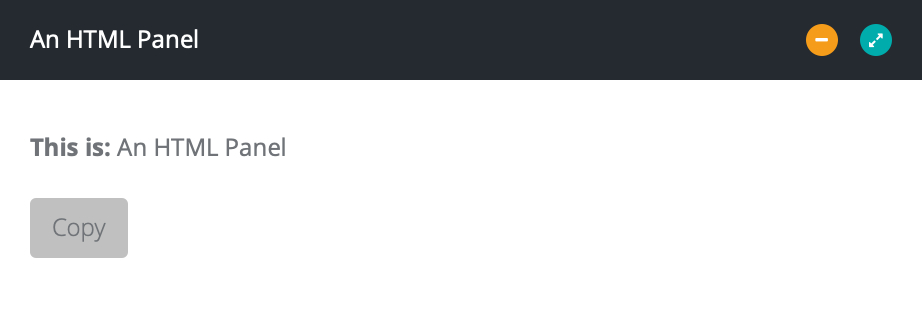
| A | B | C | |
|---|---|---|---|
| 1 | An HTML Panel | ="<b>This is: </b>" & A1 | html |
This would create an HTML-formatted panel titled An HTML Panel. Its value is set to ="<b>This is: </b>" & A1. The text shown in the HTML panel would thus be This is: An HTML Panel. Its UI string, html, is what tells Molnify to show this as an HTML-formatted panel.
The HTML panel output supports the following UI strings: html (required), amongInputs, class, dividerName, hideCopy, JSOnChange, leftColumn, noTitle, panelHidden, rightColumn, variable.
See also: info text, longinfotext.
Output Box
This is the default output type. All output boxes are rendered on the same output panel, in the order in which they appear in the spreadsheet.
Numbers are generally displayed using the client's locale. For instance, the thousand separator in some countries is , and in others it's a space ( ), etc.
If the digits are joined by a non-number character, e.g., a currency symbol, Molnify interprets the number as a text string, and the number formatting is lost.
If the number you wish to format is the value of cell A1, then TEXT(F10,"$#,##0.00") would format it with a dollar-sign as prefix, with a comma as thousands delimiter, a dot as decimals delimiter, and rounded to 2 decimal places.
Sometimes dates are represented by the number of days from January 1 1900. To format such a number as a human-readable date, you can use TEXT(A1,"MM/DD/YY").
For more examples of common formatting solutions, see Google's or Microsoft's documentation of the TEXT function.
Example:
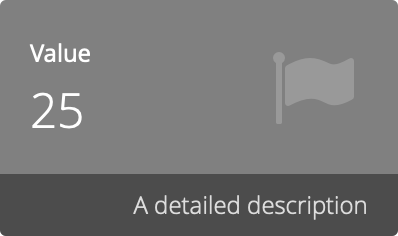
| A | B | C | |
|---|---|---|---|
| 1 | Value | =B3*B4 | icon=fa-flag;background=gray;color=white |
This example would create an output box titled Value. Its value is calculated by =B3*B4. Its UI string is icon=fa-flag;background=gray;color=white, which would tell Molnify to show the Font Awesome icon fa-flag next to the value inside the output box, set the background color to gray and the text color to white. If you add a comment to the red cell, it will be displayed below the value.
The output box output supports the following UI strings: background, class, color, decimals, dividerName, hidden, icon, JSOnChange, tab, variable.
See also: OutputBoxPanelHidden.
People Matrix
A people matrix represents a value from 0 to 100 as part of a matrix of 100 people.
Example:

| A | B | C | |
|---|---|---|---|
| 1 | Number | 10 | peopleMatrix |
This example would create a People Matrix titled Number. Its value would be 10. Its UI string, peopleMatrix, tells Molnify to display the value as 10 highlighted people out of 100.
The people matrix output supports the following UI strings: peopleMatrix (required), class, color, columns, icon, JSOnChange, leftColumn, panelHidden, rightColumn, rows, variable.
Charts
If you color a rectangular area of cells blue, you will get a chart. There are many different types of charts, such as bar charts, pie charts and more.
- Title: Specify the title of the chart in the topmost left cell.
- The actual data: The blue cells contain the actual chart data
- UI string: The topmost right cell contains UI options for the chart.
- Description: Add a comment to the chart title cell (i.e., the topmost left cell) to add a description above the chart.
To set the height of a chart, add the desired height as CSS in your
metadata. E.g.,
div[cell='Sheet1!C7:C33'] svg { height: 2000px; }
for a chart in cells C7:C33.
Bar Chart
The bar chart is the default chart type.
Note that if the chart data consists of a single data series that sums up to 1 or 100%, then the chart will be rendered as a pie chart instead.
Example:
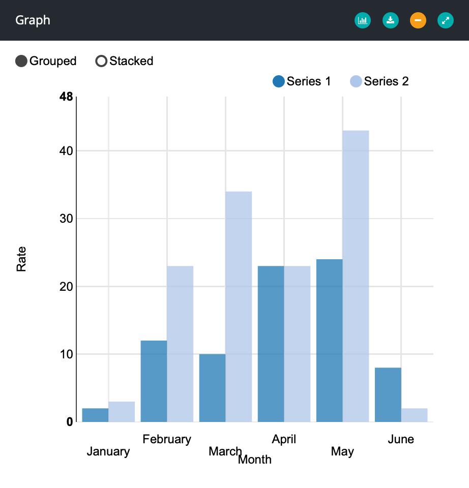
This would create a bar chart with two series and six datapoints. The chart title, Graph, is in cell A1. The series names are specified in cells B1 and C1. The labels for the datapoints are in column A. The UI string, in cell D1, is xAxis=Month;yAxis=Rate, which sets titles for the X and Y axes.
The bar chart supports the following UI strings: barChart, atLeast, axisDecimals, centerZero, class, decimals, horizontal, JSOnChange, leftColumn, noControls, noGridLines, noGroupedStackedControls, noWordWrap, panelHidden, rightColumn, series, seriesInColumns, seriesInRows, showValues, stacked, staggerLabels, xAxis, yAxis, yAxisTicks.
See also: Line/Bar chart.
Donut Chart
A donut chart is a circular chart divided into areas proportional to the percentages of the whole, with an empty space in the middle.
For a filled-in donut, see pie charts.
Example:
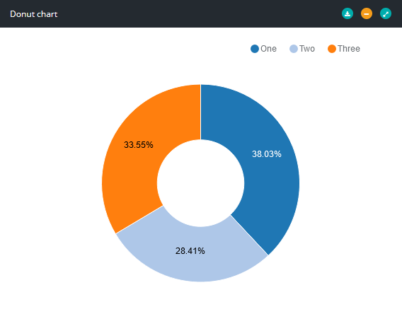
This example creates a donut chart titled A Donut Chart with three datapoints. The UI string, donutChart, instructs Molnify to show the data as a donut chart.
The donut chart supports the following UI strings: donutChart, class, decimals, JSOnChange, leftColumn, panelHidden, rightColumn, series.
Geo Chart
A geo chart shows a world map with values specified for different countries. The chart is specified the same way as a bar chart with one series. Countries are defined using country codes (e.g., US, SE, DK, NO) as datapoint labels.
Example:

This example creates a geo chart titled Geo chart five datapoints, one datapoint for each country: Sweden, Denmark, Norway, the U.S.A., and Great Britain. The UI string, geoChart, instructs Molnify to present the data as a geo chart.
The geo chart supports the following UI strings: geoChart (required), class, decimals, JSOnChange, leftColumn, map, panelHidden, rightColumn.
Line Chart
A line chart represents data as a line.
For a combined line/bar chart (UI string: lineBarChart), the first series represents the bars and the second series
represents the line. Specify atLeastSync to make atLeast=value
apply to both Y axes.
Example:

This would create a line chart titled A Line Chart with two series (An index and Another index) and twelve datapoints. The UI string, lineChart, instructs Molnify to present the data as a line chart.
The line chart supports the following UI strings: lineChart (required), atLeast, axisDecimals, class, decimals, JSOnChange, leftColumn, noGridLines, panelHidden, rightColumn, series, seriesInColumns, seriesInRows, steps, xAxis, yAxis.
See also: Line/Bar chart.
Line/Bar Chart
A line/bar chart is a bar chart where the first series of data is rendered as a bar chart, and the remaining series of data are rendered as lines on top of the bars.
Example:

This would create a line bar chart titled A Line Bar Chart with two series (An index and Another index) and twelve datapoints. The UI string, lineBarChart, instructs Molnify to present the data as a line bar chart.
The line/bar chart supports the following UI strings: lineBarChart (required), atLeast, atLeastSync, axisDecimals, class, decimals, JSOnChange, leftColumn, noGridLines, panelHidden, rightColumn, series, seriesInColumns, seriesInRows, showValues, xAxis, yAxis.
See also: Bar chart, Line chart.
Pie Chart
A pie chart is a circular chart divided into areas proportional to the percentages of the whole.
For a pie chart with a hole in the middle, see donut charts.
Example:
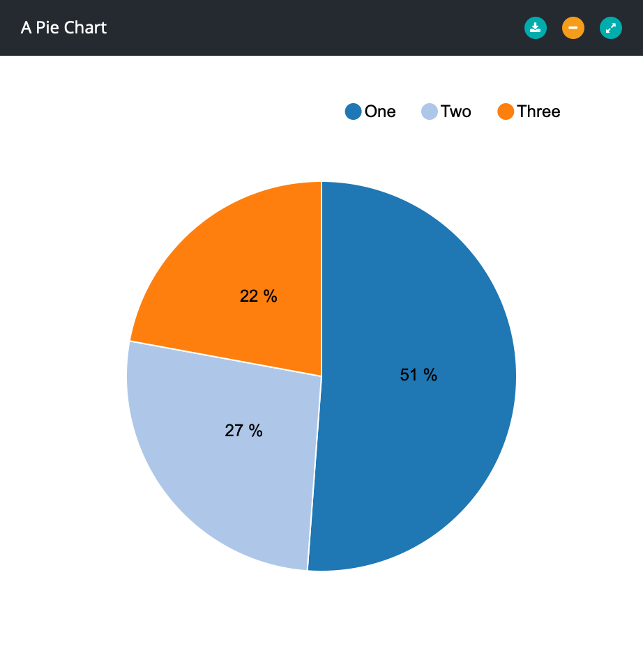
This example creates a pie chart titled A Pie Chart with three datapoints. The UI string, pieChart, instructs Molnify to show the data as a pie chart.
The pie chart supports the following UI strings: pieChart, class, decimals, JSOnChange, leftColumn, panelHidden, rightColumn, series.
Scatter Chart
To create a scatter chart, you need an area with at least three columns - series, x and y. Optionally, you can also specify size and shape.
The available shapes are:
circlediamondtriangle-uptriangle-downcrosssquare
Example:

This would create a scatter chart titled A Scatter Chart with three datapoints and two series (A and B). The UI string, scatterChart, instructs Molnify to present the data as a scatter chart.
The scatter chart supports the following UI strings: scatterChart (required), atLeast, axisDecimals, class, decimals, JSOnChange, leftColumn, noGridLines, panelHidden, rightColumn, xAxis, yAxis, yAxisTicks.
Table
Aggregated data can also be presented as a table. As with most other charts, column titles and row titles are entered outside the blue area.
Example:
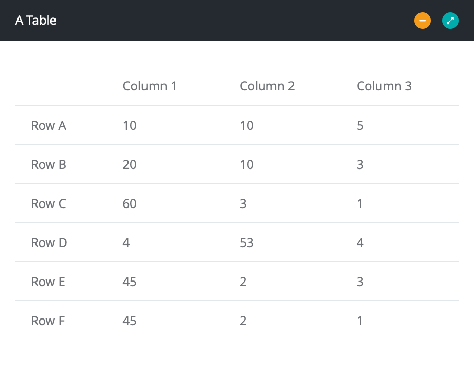
Example of how to create a table with the panel title A Table. Its UI string, table, tells Molnify to display your data as a table instead of a chart.
The table supports the following UI strings: table (required), class, decimals, JSOnChange, leftColumn, panelHidden, rightColumn.
Waterfall Chart
A waterfall chart looks like a horizontal bar chart, and shows the net change in data between point. Enter e whenever you want to present an accumulated value.
Example:

Example of how to create a waterfall chart titled A Waterfall Chart with two series (Rocks and Spoons). e lets Molnify know to show the accumulated value. e is actually also what makes it a waterfall chart without explicitly specifying it in the UI string. In this example, atLeast is set to 20 in the UI string (atLeast=20), meaning that the value 20 will always be included on the Y axis.
The waterfall chart supports the following UI strings: waterfallChart (required), atLeast, class, decimals, JSOnChange, leftColumn, noGridLines, noWordWrap, panelHidden, rightColumn, seriesInColumns, seriesInRows, showValues.
UI Strings
UI Strings are used to customize inputs, outputs, and charts. This section lists all of them, along with any notes on their usage.
acceptedFileTypes
Limits the accepted file types, by specifying comma-separated MIME types and file extensions. E.g. use image/*,application/pdf to accept all types of images
and PDFs. The file extension can be a wildcard (*).
See: File upload.
accessColumn
Overrides the app's RecordTableAccessColumn metadata for a specific Record Dropdown.
Usage: accessColumn=ownerEmail
See: Record Dropdown.
amongInputs
Displays the output element among the input elements, as if it was an input.
See: HTML panel.
atLeast
Ensures that the specified value always is shown on the y-axis of the chart. For scatter charts, define a comma-separated string of values. I.e.,
atLeast=xMin,xMax,yMin,yMax, where each position corresponds to a value that should always be covered by the chart.
Usage: atLeast=10
See: Bar chart, Line chart, Waterfall chart.
atLeastSync
If this UI string is present, then the value specified with atLeast applies to both y-axes.
See: Line/Bar chart.
axisDecimals
Sets the number of decimals to display on the axes of the chart.
Usage: axisDecimals=2
See: Bar chart, Line chart, Line/bar chart, Scatter chart.
background
Sets the background color of an output box.
Usage:
background=graybackground=#ffff00(hex code)background=#ffff0050(hex code with transparency)
See: Output box.
barChart
Specifies that the chart should be a bar chart.
See: Bar chart.
barcode
If you're planning on using a barcode scanner for entering data into the input, specify barcode as the UI string to make the text field automatically select all text upon hitting the ENTER key.
centerzero
Specifies that the values zero should always be centered in the chart.
See: Bar chart.
class
Adds a CSS class to the associated element. For complex elements that are contained in a panel, e.g., a chart, the class is applied to the whole panel body.
Usage: class=my-class. Note that the class name should not contain any ' or " characters.
See: Button group, Date-picker, Dropdown list, File upload, Infotext, Long infotext, Numeric text field, Output box, Signature, Slider, Text area, Text field, Time-picker, Toggle button, CSS.
color
Sets the text or data color of an output.
See: Output box, People matrix.
columns (People matrix)
Specifies the number of columns of the output matrix.
Usage: columns=5
See: People matrix.
date
Specifies that the input should be a date-picker.
See: Date-picker.
decimals
Sets the number of decimals to display of the data.
Usage: decimals=2
See: Bar chart, Donut chart, Geo chart, Line chart, Line/Bar chart, Output box, Pie chart, Scatter chart, Table, Waterfall chart.
delta
Sets the size of the steps of the input.
Usage: delta=0.5
See: Slider.
description
Shows a descriptive text next to a toggle input.
Usage: description=This describes this button.
See: Toggle button.
display
Column name or SQL expression shown as the dropdown label. Supports Excel-style & concatenation
as a shortcut for CONCAT(), e.g. display=firstName&' '&lastName.
SQL expressions can also be used directly, e.g. display=COALESCE(name,'(unnamed)').
Usage: display=name or display=firstName&' '&lastName
See: Row Dropdown, Record Dropdown.
dividerName
Inserts a divider with the specified title above the input. The divider is shown or hidden along with its associated input.
Adds a horizontal divider with the specified title above the input
field. The divider is shown and hidden along with the input it's associated
with.
| A | B | C | |
|---|---|---|---|
| 1 | Name | John Doe | dividerName=Personal Information |
This example would create an input titled Name with a default value of John Doe. Its UI string is dividerName=Personal Information, which would insert a divider with the title Personal Information above the input.
Usage: dividerName=Title here
See: Button group, Date-picker, Dropdown list, File upload, Infotext, Long infotext, Numeric text field, Output box, Signature, Slider, Text area, Text field, Time-picker, Toggle button.
donutChart
Specifies that the chart should be a donut chart.
See: Donut chart.
dropdown
Specifies that the input should be a dropdown list.
See: Dropdown.
fileUpload
Specifies that the input should be a file upload.
See: File upload.
filter
SQL WHERE clause for filtering rows. Use @variableName to reference current app input values.
Variable values are parameterized (safe from SQL injection).
Usage: filter=status = 'active' or filter=country = @selectedCountry
See: Row Dropdown.
geoChart
Specifies that the chart should be a geo chart.
See: Geo chart.
gridNum
Sets the number of ticks on a slider input.
Usage: gridNum=7
See: Slider.
hidden
Hides the element from the user.
| A | B | C | |
|---|---|---|---|
| 1 | Positive? | =IF(B3>0;"show";"hide") | hidden |
This would create an output with the title Positive?. Because of the UI string, hidden, it would always be hidden.
The hidden element still exists in the app, but is not rendered. This means that any formulas in the element's data are still calculated, but no element is created on the webpage.
Any input, output, or chart can be hidden using this ui string. For hiding action buttons, see the
hideCopy
Hides the copy-button associated with the element from the user.
See: HTML panel.
horizontal
If set to true, the chart will be rendered with horizontal bars.
Usage: horizontal=true
See: Bar chart.
html
Specifies that the output should be an HTML panel.
See: HTML panel.
icon
Sets the icon associated with the output or chart. Molnify supports Font Awesome icons.
Usage: icon=fa-money
See: Output box, People matrix.
infotext
Specifies that the element should be an infotext.
See: Infotext.
idVariable
Column used as the unique row identifier. Aliases: idColumn, recordTableIdVariable. Default: recordId.
Usage: idVariable=customId
See: Row Dropdown, Record Dropdown.
JSOnChange
Specifies a javascript function or single statement to run whenever the input or output is changed.
The following example would check the character length of an input with variable set to charlimit. If the length exceeds 6 characters, all characters after the sixth character are removed:
variable=charlimit;jsOnChange=if (getValueForVariable("charlimit").length > 6) setValueForVariable("charlimit", getValueForVariable("charlimit").substring(0,6));
Note that since the ui-string uses a semicolon ; as delimiter between its items, your Javascript code for JSOnChange cannot contain any semicolons.
Similarly, since Molnify stores the JSOnChange contents as an HTML DOM attribute, the JSOnChange code cannot contain any apostrophes '.
To run several functions or lines of code, you can define a custom function in the JavaScript metadata field, and call your custom function with JSOnChange.
leftColumn
Specifies that a panel should be in the left column.
See: HTML panel, People matrix, Bar chart, Donut chart, Geo chart, Line chart, Line/Bar chart, Pie chart, Scatter chart, Table, Waterfall chart.
lineBarChart
Specifies that the chart should be a line/bar chart.
See: Line/Bar chart.
lineChart
Specifies that the chart should be a line chart.
See: Line chart.
longinfotext
Specifies that the input element should be a long infotext.
See: Long infotext.
manager
Specifies that the input cell should contain TRUE or FALSE, depending on if the user is a manager or not.
See: Manager, Superuser, User.
map
Sets the region which the chart will show.
Currently, the following maps are supported:
se_mill- A map of Sweden's counties, with Swedish labels.world_mill_en- A map of the world's countries, with English labels.
See: Line/Bar chart.
map (Row Dropdown)
Column-to-variable mappings for a Row Dropdown. If omitted, columns are auto-mapped to app variables with matching names.
Usage: map=col1->var1,col2->var2
See: Row Dropdown.
max
Sets the maximum value of the input.
Usage: max=10
See: Numeric text field, Slider.
maxFiles
Sets the maximum number of files that can be uploaded to the input by the current user.
Usage: maxFiles=4
See: File Upload.
maxRows
Maximum number of rows returned by the dropdown. Default: 1000.
Usage: maxRows=200
See: Row Dropdown, Record Dropdown.
min
Sets the minimum value of the input.
Usage: min=-10
See: Numeric text field, Slider.
multiple
Enables multiple selections in a dropdown menu, add multiple to the UI string. The selected
values will be concatenated into one semicolon-separated text string. E.g., selecting Sweden and
Denmark will result in a value of Sweden;Denmark.
See: Dropdown list.
Example:

| A | B | C | |
|---|---|---|---|
| 1 | Countries | dropdown;multiple |
This example would create an input titled Countries with no default value. Its UI string is dropdown;multiple, which would instruct Molnify to create a dropdown menu enabled for multiple selections.
To have multiple options selected as default, add JavaScriptAfterLoad
to your metadata and set it to
$("[cell='Sheet1!B3']").val(["Sweden", "Denmark"]).change(). Exchange
Sheet1!B3 for the cell corresponding to your dropdown.
noButtons
Hides the plus and minus buttons that otherwise are shown next to the input.
See: Numeric text field.
NOCALC
Specifies that the input should not be passed along at calculation.
See: Button group, Date-picker, Dropdown-list, File upload, Numeric text field, Signature, Slider, Text area, Text field, Time-picker, Toggle button.
noControls
Hides the grouped/stacked buttons and the series legend buttons in the chart.
See: Bar chart, noGroupedStackedControls.
noGridLines
Hides the grid lines in the chart.
See: Bar chart, Line chart, Line/Bar chart, Scatter chart, Waterfall chart.
noGroupedStackedControls
Hides the grouped/stacked buttons in the chart.
See: Bar chart, noControls.
noWordWrap
Disables word wrapping of the labels for a horizontal bar chart.
See: Bar chart, Waterfall chart.
noTitle
Hides the title of the element, and specifies that it should be shown full width.
See: Button group, Date-picker, Dropdown-list, File upload, HTML panel, Infotext, Long infotext, Numeric text field, Signature, Slider, Text area, Text field, Time-picker, Toggle button.
orderBy
Orders the rows in the dropdown. Uses SQL syntax. Default: most recently inserted first.
Usage: orderBy=name ASC
See: Row Dropdown, Record Dropdown.
panelHidden
Collapses the panel which contains the element.
See: Bar chart, Donut chart, Geo chart, HTML panel, Line chart, Line/Bar chart, People matrix, Pie chart, Scatter chart, Table, Waterfall chart.
peopleMatrix
Specifies that the output should be a people matrix.
See: People matrix.
pieChart
Specifies that the chart should be a pie chart.
See: Pie chart.
placeholder
Shows a grayed text in the input field, intended to guide the user.
Usage: placeholder=This text is helpful.
See: Text area, Text field.
postFix
Adds a short text after the input field.
Usage: postFix=This text is helpful.
See: Numeric text field, Text field.
preFix
Adds a short text before the input field.
Usage: preFix=This text is helpful.
See: Numeric text field, Text field.
range
Specifies that the input should be a range slider, i.e. visualise an interval. The slider will have a lower and an upper handle, which may not be crossed.
In the Excel sheet, the input cell will have values separated with a
semicolon (;). If you omit the semicolon and only provide
a single value, the two handles will overlap initially.
See: Slider.
regEx
Restricts the possible inputs, so that inputs must not match the specified regular expression.
Usage: regEx=[^a-zA-Z] (restricts input to only accept letters a-z and A-Z.)
See: Numeric text field, Text field.
resetWhenHidden
Resets an input to its default value while it is hidden. On being shown again, the input regains the value it had prior to being hidden.
See: Button group, Date-picker, Dropdown list, Numeric text field, Slider, Text area, Text field, Time picker, Toggle button.
rightColumn
Specifies that a panel should be in the right column.
See: HTML panel, People matrix, Bar chart, Donut chart, Geo chart, Line chart, Line/Bar chart, Pie chart, Scatter chart, Table, Waterfall chart.
recorddropdown
Specifies that the input should be a record dropdown.
See: Record Dropdown.
rowdropdown
Specifies that the input should be a row dropdown.
See: Row Dropdown.
rows
Specifies the number of rows of the output matrix.
Usage: rows=4
See: People matrix.
scatterChart
Specifies that the chart should be a scatter chart.
See: Scatter chart.
select
Specifies that the input should be a button group.
See: Button group.
series
Sets options for the specified series of a chart. The series are indexed starting from 0.
The options available are
.color.showArea.strokeWidth.dashedLine
Usage:
series0.color=redseries1.color=#00FF00series2.color=#FFFF0050series0.showAreaseries0.strokeWidth=4series0.dashedLine
See: Bar chart, Donut chart, Line chart, Line/Bar chart, Pie chart, Waterfall chart.
seriesInColumns
Specifies that the series used for chart data are ordered in columns.
See: Bar chart, Line chart, Line/Bar chart, Waterfall chart.
seriesInRows
Specifies that the series used for chart data are ordered in rows.
See: Bar chart, Line chart, Line/Bar chart, Waterfall chart.
showIfCell
This feature is deprecated. It is now recommended to use showIfVariable instead of showIfCell in every case. The showIfVariable UI string can perform the same function as showIfCell, but results in a spreadsheet which is more maintainable and readable.
Hides the associated input or output if the specified cell's value matches the value specified using showIfValue or showIfValueNot.
| A | B | C | |
|---|---|---|---|
| 1 | Name | showIfCell=Sheet1!B3;showIfValue=A |
This would create an input with the title Name. Because of the UI string, showIfCell=Sheet1!B3;showIfValue=A, the input would only be visible when an input or output in cell Sheet1!B3 is A.
Usage: showIfCell=cell_address;showIfValue=value_to_match.
See this youtube video for a tutorial on conditionally showing input and output elements in a Molnify app.
See: Button group, Date-picker, Dropdown list, File upload, Infotext, Long infotext, Numeric text field, Output box, Signature, Slider, Text area, Text field, Time-picker, Toggle button.
showIfVariable
Hides the associated input or output if the specified variable or named range's value matches the value specified using showIfValue or showIfValueNot.
| A | B | C | |
|---|---|---|---|
| 1 | Name | showIfVariable=VarName;showIfValue=A |
This would create an input with the title Name. Because of the UI string, showIfVariable=VarName;showIfValue=A, the input would only be visible when an input or output with variable=VarName is A.
Usage: showIfVariable=variable_name;showIfValue=value_to_match.
See this youtube video for a tutorial on conditionally showing input and output elements in a Molnify app.
See: Button group, Date-picker, Dropdown list, File upload, Infotext, Long infotext, Numeric text field, Output box, Signature, Slider, Text area, Text field, Time-picker, Toggle button.
showIfValue
Hides the associated input or output if the value of the specified cell (using showIfVariable) or variable (using showIfVariable) equals the value specified by this ui-string.
Note that the boolean values for TRUE and FALSE should always be entered in English.
| A | B | C | |
|---|---|---|---|
| 1 | Name | showIfCell=Sheet1!B3;showIfValue=A |
This would create an input with the title Name. Because of the UI string, showIfCell=Sheet1!B3;showIfValue=A, the input would only be visible when an input or output in cell Sheet1!B3 is A.
Usage: showIfCell=cell_address;showIfValue=value_to_match.
For more complex conditions, you may use an output box to render, e.g., show or hide.
This cell can then be referenced, e.g., showIfCell=Sheet1!B3;showIfValue=show, where
Sheet1B3 is the hidden output box. Read more about hidden inputs and outputs.
See this youtube video for a tutorial on conditionally showing input and output elements in a Molnify app.
See: Button group, Date-picker, Dropdown list, File upload, Infotext, Long infotext, Numeric text field, Output box, Signature, Slider, Text area, Text field, Time-picker, Toggle button.
showIfValueNot
Hides the associated input or output if the value of the specified cell (using showIfCell) or variable (using showIfVariable) does not equal the value specified by this ui-string.
Note that the boolean values for TRUE and FALSE should always be entered in English.
| A | B | C | |
|---|---|---|---|
| 1 | Name | showIfCell=Sheet1!B3;showIfValueNot=A |
This would create an input with the title Name. Because of the UI string, showIfCell=Sheet1!B3;showIfValueNot=A, the input would only be visible when an input or output in cell Sheet1!B3 is not A.
Usage: showIfCell=cell_address;showIfValueNot=value_to_not_match.
For more complex conditions, you may use an output box to render, e.g., show or hide.
This cell can then be referenced, e.g., showIfCell=Sheet1!B3;showIfValue=show, where
Sheet1B3 is the hidden output box. Read more about hidden inputs and outputs.
See this youtube video for a tutorial on conditionally showing input and output elements in a Molnify app.
See: Button group, Date-picker, Dropdown list, File upload, Infotext, Long infotext, Numeric text field, Output box, Signature, Slider, Text area, Text field, Time-picker, Toggle button.
showValues
Specifies that data values should be shown directly in the chart.
See: Bar chart, Line/Bar chart, Waterfall chart.
signature
Specifies that the input should be a signature.
See: Signature.
slider
Specifies that the input should be a slider.
See: Slider.
stacked
Renders the chart with bars stacked as default.
See: Bar chart.
staggerLabels
Enables or disables staggering of the x-axis labels. Default behaviour is determined by the number of labels.
Usage: staggerLabels=True
See: Bar chart.
steps
Renders the chart as a step chart.
See: Line chart.
superuser
Specifies that the input cell should contain TRUE or FALSE, depending on if the user is a superuser or not.
See: Superuser, Manager, User.
tab
Renders the input, and all inputs after this, on a new tab with the specified title. Any input defined before the first tab is rendered on all tabs. The title of the
currently selected tab will be populated into all input cells where the UI string variable=molnifyCurrentTab is present.
| A | B | C | |
|---|---|---|---|
| 1 | An input | tab=Second tab |
This would create an input field with the title An input. Its UI string, tab=Second tab, tells Molnify to add this input and all following inputs in the tab named Second tab.
A tab is shown and hidden along with the input it is associated with. As such, hiding the associated input with conditional show hides the entire tab.
See: Button group, Date-picker, Dropdown list, File upload, Infotext, Long infotext, Numeric text field, Signature, Slider, Text area, Text field, Time-picker, Toggle button.
table
Specifies that the data is to be presented as a table.
See: Table.
tableName
Database table name. Alias: recordTableName.
Usage: tableName=data_myapp_0
See: Row Dropdown, Record Dropdown.
tag
The tags tag1, tag2, tag3, ..., to tag10 can be given values associated with different users.
These values can be accessed through input fields with the ui strings tag1, tag2, tag3, ..., to tag10.
These input fields are hidden automatically.
| A | B | C | |
|---|---|---|---|
| 1 | tag1 |
This input will receive the value of the logged in user's "Tag 1".
Note that this feature requires the Metadata DBUsers to be set to TRUE. The interface to assign values to the tags for different users can then be accessed through the application's sidebar.
textarea
Specifies that the input should be a text area.
See: Text area.
time
Specifies that the input should be a time-picker.
See: Time-picker.
user
Specifies that the input cell should be hidden and contain the user's identification. This can either be their email, or their identificationnumber, depending on their method of signing in.
In order to retrieve exactly the user's email or identificationnumber, use user.email or user.identificationnumber, respectively.
See: User, Manager, Superuser.
variable
Assigns a variable name to any associated input or output. By itself, a variable name does not serve a function, but it is used by various other functions.
You can initialize inputs by passing parameters in the app's URL.
Add a variable name to the inputs you want to initialize. Then append ?variable_name=VALUE
to your app URL, e.g.,
app.molnify.com/app/myForm?firstName=John&lastName=Doe.
This would initialize the input with variable name firstName
with John and lastName with Doe.
See: addRecord, generateReport, getValueForVariable, EnabledForSave, setValueForVariable, showIfVariable, tab.
waterfallChart
Specifies that the chart should be a waterfall chart.
See: Waterfall chart.
xAxis
Sets the title of the chart's x-axis.
Usage: xAxis=Months
See: Bar chart, Line chart, Line/Bar chart, Scatter chart.
yAxis
Sets the title of the chart's y-axis.
Usage: yAxis=Rate
See: Bar chart, Line chart, Line/Bar chart, Scatter chart.
yAxisTicks
Sets the number of ticks to always display on the chart's y-axis.
Usage: yAxisTicks=3
See: Bar chart, Line chart, Line/Bar chart, Scatter chart.
Actions
If you color a column of cells yellow, you will get an action. An action is a button that the user can click on to execute the specified action. Molnify can perform a wide range of different actions, such as sending emails and adding data to Google Sheets spreadsheets.
- Action option: The cells to the left of the yellow cells define the options to apply to the action.
- Action option value: The contents of the yellow cells determine the value to apply to the corresponding action option.
Example:

This example would create an email action (however, to, from, subject and content would also be needed). The action button is titled Click Here and is named Action1. The button is configured to be displayed at the bottom of the page. Finally, the button would only be visible if cell Sheet1!B1 is TRUE.
An action button is shown on all input tabs. In certain cases, you may wish for the button to show on only one tab of inputs. A solution to this
is to use hidden to hide the original action button, and then use an HTML panel to create the button such
as <button onclick="performActionWithName('my-action')" class="btn btn-sm btn-success buttonMargin molnifyActionButton">Click this!</button>,
where my-action is the name of the action to hide.
AI Prompt
This action sends a prompt to an AI model and returns the response. The response is stored in a variable named aipromptresponse,
accessible through Excel formulas or e.g. getValueForVariable.
This example creates an AI prompt action, since type is set to aiprompt. The action button's title will be Ask AI. The model is set to gemini-flash, and the prompt specifies the text to send to the AI model.
The response from the AI model is put in the variable aipromptresponse, and may be used in the app through e.g. getValueForVariable.
The AI Prompt action supports the following action options: type (required, aiprompt), model (required), prompt (required), hidden, maxOutputTokens, name, position, requestHandler, responseSchema, responseVariable, showIfCell, showIfValue, showIfValueNot, skip, successCalculate, successFrameURL, successHTMLElementContent, successHTMLElementId, successJavaScript, successNewTabURL, successRefreshScenarioList, successSilent, successText, successURL, thinkingBudget, title.
Add Record to Database
The add record action stores a "record" or a "snapshot" of the application's variables. The stored record is given a unique ID,
which is a non-negative integer. The ID of the saved record is assigned to a variable named recordId,
and the complete data entry of a recordId can be loaded through the URL parameter recordId, e.g. app.molnify.com/app/myApp?recordId=24.
In order for this action to work, you will need to specify the name of the database by using the metadata RecordTableName.
To set up a database table for use with the Add Record to Database action, you need to:
- Define a column
recordId, of a datatype which can accept integer values (e.g. UNSIGNED INT) - Set the recordId column to be the primary key by defining an index on it with the name
PRIMARY - Set the recordId to not be nullable, and to be auto incrementing
Read more about enabling database connections for your app.
Example:

This example creates an add record action, since type is set to addRecord. The action button's title will be Add Record to database.
The Add Record to Database action supports the following action options: type (required, addRecord), hidden, idVariable, name, position, recordTableName, requestHandler, saveIP, showIfCell, showIfValue, showIfValueNot, skip, successCalculate, successFrameURL, successHTMLElementContent, successHTMLElementId, successJavaScript, successNewTabURL, successRefreshScenarioList, successSilent, successText, successURL, title.
See also: Add Row to Database, Record Dropdown.
Add Row to Google Sheets Document
This action creates a button that adds data as a new row to a Google Sheets document. In order for this action to work,
you will need to ensure that molnify-librarian@rapidcomputeengine.iam.gserviceaccount.com has write-access to your Google Sheets document.
Use the options id to specify the document's URL, and sheet to specify which sheet to add the row to.
To specify the data to add to the Google Sheets document, add rows to this action with column number and content, e.g.,
1: Content to add in column 12: Content to add in column 23: Content to add in column 3
For numbers to be correctly treated by Google Sheets, set the locale of your Google Sheets document to United States (File -> Spreadsheet settings... -> Locale: United States).
Example:

This example creates an add row to a Google Sheets document, since type is set to addRow. The action button's title will be Add row to Sheets.The data will be inserted into the columns of 'Sheet1', of the Google Sheets document specified by the URL id.
The add row to Google Sheets action supports the following action options: id (required), type (required, addRow), hidden, name, position, requestHandler, sheet, showIfCell, showIfValue, showIfValueNot, skip, successCalculate, successFrameURL, successHTMLElementContent, successHTMLElementId, successJavaScript, successNewTabURL, successRefreshScenarioList, successSilent, successText, successURL, title.
Add Row to Database
Use this action to store data in an SQL database.
If this action is present in an app, superusers are able to export all stored data as a spreadsheet alongside with the email and IP address of the user who entered the data, including a timestamp of when the data was saved. Additionally, it is possible to fetch this data via a REST API.
To specify the data to add to the database, add rows to this action with column name (prefixed with a ".") and content, e.g.,
.first_column: Content to add to first_column.second_column: Content to add in second_column.third_column: Content to add in third_column
To update a database record, prefix your primary key column with a "k". If any matching record is found it will be updated.
k.primary_key_column: Some contents
Read more about enabling database connections for your app.
Example:

This example creates an add row to database action, since type is set to insertRow. The action button's title will be Add Data. The values for the database columns 'key' (also primary key), 'col1', and 'col2' will be inserted into the database table data_my_table.
The insert row to database action supports the following action options: tableName (required), type (required, insertRow), hidden, idVariable, name, position, requestHandler, saveIP, showIfCell, showIfValue, showIfValueNot, skip, successCalculate, successFrameURL, successHTMLElementContent, successHTMLElementId, successJavaScript, successNewTabURL, successRefreshScenarioList, successSilent, successText, successURL, title.
See also: Add Record to Database, Row Dropdown.
Create E-sign Agreement
The Create E-sign Agreement action creates a PDF populated with variables from your Molnify application, and sends it to an e-sign provider, to allow users to sign the PDF securely.
The PDF creation, template and parameters are identical to those specified by the Generate a PDF Report action.
The following action options are used to configure the PDF which will be signed: template (required), cssPageSize, fileName, landscape, margin, marginBottom, marginLeft, marginRight, marginTop, paperSize
Example:
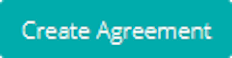
This example creates a Create E-sign Agreement action, since type is set to createEsign. The action puts the app's variables into the HTML template, translates the template into a PDF file, and then sends it to the e-sign provider.
In this case, the action will agreement will first be sent to John Doe for signing, and then to FOO AB once John Doe has signed the document. If signingOrder had been set to FALSE, then both John Doe and FOO AB would have received the invitations to sign simultaneously, and they could sign the document in any order.
PDF Attachments
Additional PDF files may be attached to the main document using the attachments action option. To add a file as an attachment, specify its URLs in the value of the option.
Note that the attached documents must be PDF files.
Multiple attachments may be specified by comma-separating their URLs. This is the same syntax as the value of a fileupload input containing multiple files.
Signing participants
To add people to your e-sign agreement, you specify their:
- email (required)
- name
- role
The name is the display name of the signer, and will be defaulted to their email address if not provided.
To add a signer to the action, you choose a "key" for the signer.
No other signer in the same action may have the same key.
Then, you add their email, name, and role by specifying key.email,
key.name, and key.role.
Customizing the signing process
If ordered signing (signingOrder) is enabled (TRUE),
then the signers will be ordered based on the keys' alphabetic order.
Otherwise, the signers may sign the document in any order.
The following additional options can be used to customize the e-signing experience. If no default value of an option is given, then consult your provider's documentation for the default value:
| Option | Default value | Brief explanation |
|---|---|---|
sendEmails |
TRUE | If TRUE, the e-sign provider will send emails to nofity the signees when it is their turn to sign the document. Otherwise, you will need to notify the signees yourself |
trustLevel |
SES | Can either be SES (Simple Electronic Signatures) or AES (Advanced Electronic Signatures). Choose the appropriate method depending on your document's needs |
theme |
Provide the identifier for a theme for your document's signing environment, to apply your own styling or branding | |
successCallbackUrl |
Choose a URL to redirect the user to after signing the document | |
defaultLocale |
sv-SE | Determines the primary language to be used in all communication and user interfaces by the e-sign provider |
Supported providers
You will need to choose an e-sign solution provider, by setting the provider action option.
Additionally, you will need to provide API key details for your chosen provider by setting the
apiID and apiSecret options. By using the action, Molnify will authenticate
and use your API key to create the e-sign agreement. Contact your chosen e-sign provider for pricing information.
Molnify supports the following e-sign providers. If you wish to use an e-sign provider not on this list, contact us at info@molnify.com.
Zigned is a Swedish e-signing platform designed for businesses seeking a seamless, transparent, and commitment-free way to handle the signing of agreements digitally. With pure usage-based pricing, Zigned removes complexity and ensures secure, eIDAS-compliant signing effortlessly. Built for flexibility, it integrates smoothly into any workflow, making your business more efficient and secure, without the overhead. No hidden costs – just pay for completed signatures. You can read more about them at www.zigned.se.
Role
The Zigned integration supports the signer and the approver
roles. The "signer" participants will be required to sign the document, and the "approver" participants
will be able to either greenlight or disapprove of the entire signing process.
The default role is signer.
Swedish Personal Number
In addition to the default participant properties, Zigned supports the personalnumber property.
If a participant has been set up with a Swedish personal number, then they must sign the document using
methods that verify their identity (such as Swedish Mobile BankID). Only an identity with a matching
Swedish personal number may sign the document. Note that this stores (hashed) personal numbers in Zigned's system.
Molnify does not store any personal numbers used in this action.
Owner
When creating an agreement using Zigned, the agreement's owner is automatically the API key used.
However, you can use the option owner to set a different owner of the agreement.
An agreement's owner is able to see the agreement in Zigned's interface, as if they had created the agreement.
Lookup key
Zigned allows you to assign a custom lookup_key to the agreement, by using the action option lookupKey.
By setting this key, you can easily look up the agreement in your own API calls to Zigned.
The Create E-sign Agreement action supports the following action options: apiID (required), apiSecret (required), provider (required), template (required), type (required, createEsign), cssPageSize, defaultLocale, engine, fileName, hidden, includeBackground, landscape, lookupKey, margin, marginBottom, marginLeft, marginRight, marginTop, mediaType, name, owner, pageRanges, paperSize, performanceMode, position, requestHandler, sendEmails, showIfCell, showIfValue, showIfValueNot, signingOrder, skip, successCalculate, successCallbackUrl, successFrameURL, successHTMLElementContent, successHTMLElementId, successJavaScript, successNewTabURL, successRefreshScenarioList, successSilent, successText, successURL, theme, title, trustLevel, waitDelay, waitForExpression.
Download Database Table
This action enables users to download a database table. The resulting file will be in .csv format, with semicolon ; as delimiter.
Read more about enabling database connections for your app.
Example:

This example creates a download table action, since type is set to downloadTable. The action button's title will be Download Table, and clicking on it will download the table data_my_table.
The Download Database Table action supports the following action options: tableName (required), type (required, downloadTable), hidden, name, position, requestHandler, showIfCell, showIfValue, showIfValueNot, skip, successCalculate, successFrameURL, successHTMLElementContent, successHTMLElementId, successJavaScript, successNewTabURL, successRefreshScenarioList, successSilent, successText, successURL, title.
See also: Download Query Data.
Download Query Data
This action enables users to download data in CSV or JSON format, based on a custom MySQL query.
Read more about enabling database connections for your app.
Example:

This example creates a download query action, since type is set to downloadQuery. The action button's title will be Download Query.The result of the MySQL query will be downloaded as a csv file, delimited by semicolons ;).
The Download Query Data action supports the following action options: query (required), type (required, downloadQuery), delimiter, format, hidden, name, position, requestHandler, showIfCell, showIfValue, showIfValueNot, skip, successCalculate, successFrameURL, successHTMLElementContent, successHTMLElementId, successJavaScript, successNewTabURL, successRefreshScenarioList, successSilent, successText, successURL, title.
See also: Download Database Table.
This action creates a button that sends an email.
Example:
This example creates an email action, since type is set to email. The action button's title will be Send email. Other options, such as to, from, subject and content, are specified on separate rows.
The Email action supports the following action options: to (required), type (required, email), content, contenthtml, from, hidden, name, position, requestHandler, showIfCell, showIfValue, showIfValueNot, skip, subject, successCalculate, successFrameURL, successHTMLElementContent, successHTMLElementId, successJavaScript, successNewTabURL, successRefreshScenarioList, successSilent, successText, successURL, title.
Generate File
This action enables you to generate files from within your app. The generated files may either be PDF or Excel files and are generated and downloaded when the action is executed. This action requires an output file template, which defines the output file.
Copying values.
When generating the file, Molnify will copy the contents of any single-cell named ranges into matching single-cell named ranges of the first sheet of the template.
E.g. if there are cells in your application sheet named Data1 and NotData1, and there is a named cell on the first sheet in your template file named Data1, then the file
generated from the template will have the value from Data1 copied into the template's named cell Data1. But the value of NoteData1 will not be copied, as there is no cell named NoteData1 in the template file.
Additionally, you may use tables to specify values to copy. Molnify will copy the contents of any table from the application sheet into any table on the template's first sheet if the tables have the same name. Note that Google Sheets does not support tables as of April 2024, and so templates using Google Sheets are limited to copying values using named single-cell ranges.
Template.
The template can be either an .xlsx-file or a Google spreadsheet. The template may contain images, charts, functions, and any styling you may want.
If your template is an .xlsx-file, name it Template_MyFileName ("MyFileName" can be set to anything you like), and email it to info@molnify.com, and it will be made available.
If your template is in Google Sheets, ensure that molnify-librarian@rapidcomputeengine.iam.gserviceaccount.com is able to read the document.
Example:

This example creates a generate file action, since type is set to generateFile. The action button's title will be Generate PDF Report. The report will be populating the template with variables from the app, and then generate a PDF file with the result. The resulting file will be downloaded by the user.
The Generate File action supports the following action options: template (required), type (required, generateFile), fileName, format, hidden, landscape, name, overwriteFormatting, position, protectWorkbook, requestHandler, showIfCell, showIfValue, showIfValueNot, skip, successCalculate, successFrameURL, successHTMLElementContent, successHTMLElementId, successJavaScript, successNewTabURL, successRefreshScenarioList, successSilent, successText, successURL, title, workbookPassword.
Generate a PDF Report
The Generate a PDF Report action now supports templates written in Markdown, Excel, and Word. To learn more, contact us.
The generate report action creates a PDF report based on a template. The template may be either HTML or Markdown (with Mustache templating), Excel (xlsx), or Word (docx).
The generated report can be sent to an email, by providing to among the UI string options.
Other UI-string options corresponding to the Email action, such as content
and from are also supported.
Include {{urlToReport}} in the email content where you want the report URL to be inserted.
To learn about using Word templates, visit this guide.
To learn about using Excel templates, visit this other guide.
You can manage your templates in the Template Manager.
The following is a reference to creating a report using HTML and Mustache.
Example:

This example creates a generate report action, since type is set to generateReport. The action puts the app's variables into the HTML template, and then translates it into a PDF file.
Copying values.
When generating a report, Molnify will copy any input or output variables to your template.
E.g. add variable=myInput to the UI cell of an input in your app, and reference it in your Mustache template using {{inputs.myInput}}.
Additionally, Molnify will copy any named tables to your template.
Elements of your app are referred to in Mustache as follows:
- Inputs - referenced by
inputs.variableName - Outputs - referenced by
outputs.variableName - Charts - referenced by
charts.variableName - Named ranges - referenced by
namedRanges.name
Template.
Use the Template Manager, accessible from your app's sidebar, to upload a template.
The template's main file must be called index.html.
To view all the data your app provides when running the action, open the Sidebar, and click Debug. Select your Generate Report action from the dropdown menu in the Action section, and click Run Action.
To include charts in your generated PDF, reference them using charts.variableName. This provides
the full SVG of the chart.
Remember to surround the variable name in your Mustache template with three curly brackets to render the HTML, i.e, {{{charts.myBarChart}}}.
A File Upload input can contain multiple files, which are represented as a value of comma-separated URLs.
If there is only one file, you can reference it as {{myFileUpload}}, to retrieve the file URL.
To iterate over multiple files in a File Upload input, use the {{myFileUpload_array}} property, which provides an array of URLs,
e.g., ["https://.../image1.jpg","https://.../image2.jpg"].
To include a signature in your PDF report, see the JavaScriptcopySVGToTextInput and use the hidden SVG input in your template.
Remember to surround the variable name in your Mustache template with three curly brackets to render the HTML, i.e, {{{inputs.mySignature}}}.
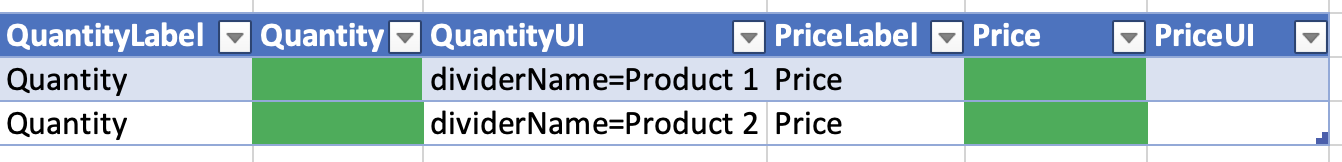
This small example demonstrates a Mustache HTML template with:
- A title
- An iteration over all inputs in the table named Products (shown in the image above)
- An image from a File Upload input
Example:
<html>
 <body>
  <h1>{{inputs.title}}</h1>
   {{#namedRanges.Products}}
   <p>Quantity: {{Quantity}} {{#Price}}at price: {{Price}}{{/Price}}</p>
   {{/namedRanges.Products}}
   <img src="{{inputs.anImage}}" height="400" width="auto" />
  </body>
 </html>
The generate pdf report action supports the following action options: , template (required), type (required, generateReport), content, contenthtml, cssPageSize, engine, fileName, from, hidden, includeBackground, landscape, margin, marginBottom, marginLeft, marginRight, marginTop, mediaType, name, pageRanges, paperSize, performanceMode, position, requestHandler, showIfCell, showIfValue, showIfValueNot, skip, subject, successCalculate, successFrameURL, successHTMLElementContent, successHTMLElementId, successJavaScript, successNewTabURL, successRefreshScenarioList, successSilent, successText, successURL, suppressDownload, title, to, waitDelay, waitForExpression.
Multiple Actions
The Multiple Action performs several actions in sequence. Note that any options specified for a Multiple Action will override the options for its component actions while it is performed.
To specify which actions to perform in the sequence, add rows to this action with the Name of each action to perform:
1: The name of the first action to perform.2: The name of the second action to perform.3: The name of the third action to perform.- ... and so on
Example:

This example creates a multiple action, since type is set to multiple. Executing the action will cause all of its component actions - action1 and action two - to be performed, in order.
The Multiple Action supports the following action options: type (required, multiple), hidden, name, position, requestHandler, showIfCell, showIfValue, showIfValueNot, skip, successCalculate, successFrameURL, successHTMLElementContent, successHTMLElementId, successJavaScript, successNewTabURL, successRefreshScenarioList, successSilent, successText, successURL, title.
Reset Inputs
This action resets input variables to specified values, or to their spreadsheet defaults. Specify the variables to reset by adding rows prefixed with a "." followed by the variable name. If a value is provided, the variable is reset to that value; if no value is given, it is reset to the spreadsheet default.
If no variables are specified (i.e., no "." rows), all input variables are reset to their spreadsheet defaults.
Example:
.name:Default Name— resets the name variable to "Default Name".age: (empty) — resets the age variable to its spreadsheet default
This example creates a reset inputs action, since type is set to resetInputs. The action button's title will be Reset Form. The variable name will be reset to "Default Name", and age will be reset to its spreadsheet default.
The Reset Inputs action supports the following action options: type (required, resetInputs), hidden, name, position, requestHandler, showIfCell, showIfValue, showIfValueNot, skip, successCalculate, successFrameURL, successHTMLElementContent, successHTMLElementId, successJavaScript, successNewTabURL, successRefreshScenarioList, successSilent, successText, successURL, title.
Save Scenario
A scenario is a snapshot of the current state of the app. It stores the state of all the app's inputs, outputs, and charts. A scenario can then be loaded through through a scenario-specific URL, or through a dropdown menu if the metadata EnabledForSave is set.
This action saves a scenario. If a scenario with the same name already exists, it will be overwritten.
Add an input with the UI string variable=molnifyCurrentScenario to have that input contain the name of the currently selected scenario.
Add an input with the UI string variable=molnifyCurrentScenarioLink to have that input contain a link to the currently selected scenario.
Example:

This example creates a save scenario action, since type is set to scenarioSave. Other options, such as private, are specified on separate rows.
The Save Scenario action supports the following action options: newName (required), type (required, scenarioSave), allowOverwrite, hidden, name, oldName, overwriteCurrentScenario, position, private, requestHandler, showIfCell, showIfValue, showIfValueNot, skip, successCalculate, successFrameURL, successHTMLElementContent, successHTMLElementId, successJavaScript, successNewTabURL, successRefreshScenarioList, successSilent, successText, successURL, title.
See also: EnabledForSave, ScenarioSharedUsersCell, ScenarioTerm.
Send an HTTP Request
This action sends an HTTP request to the specified URL. Options for specifying request authorization, method, and payload are available.
Example:

This example creates an http action, since type is set to http. The action button's title will be Perform HTTP request, and the action will have the internal name http request. When activated, the action sends a POST request to the URL https://httpbin.org/anything with the JSON payload {"data": "foo"}.
The response from the http request is put in the variable httpresponse, and may be used in the app through e.g. getValueForVariable.
The Send an HTTP Request action supports the following action options: type (required, http), url (required), authorizationType, autopayload, contentType, hidden, method, name, payload, position, requestHandler, responseVariable, showIfCell, showIfValue, showIfValueNot, skip, successCalculate, successFrameURL, successHTMLElementContent, successHTMLElementId, successJavaScript, successNewTabURL, successRefreshScenarioList, successSilent, successText, successURL, title, token.
Action options
Molnify supports the following action options.
allowOverwrite
Permit the saved scenario to be overwritten by other users.
The default is FALSE.
Usage: allowOverwrite : TRUE
This action option is supported by the following actions: Save Scenario.
apiID
Provide the client API key ID required to use the action.
Usage: apiID : key_to_api_123456
This action option is supported by the following actions: Create E-sign Agreement.
apiSecret
Provide the client API key secret required to use the action.
Usage: apiSecret : secret_to_api_123456
This action option is supported by the following actions: Create E-sign Agreement.
attachments
Specify the URL(s) of files to attach to the e-sign agreement. This does not specify the main file, use template to generate it.
Multiple attachments can be attached by comma-separating their URLs.
Usage: attachments: https://reports.example.com/my-annex.pdf
This action option is supported by the following actions: Create E-sign Agreement.
authorizationType
If specified, the header "Authorization" will be sent with the value authorizationType + " " + token.
The default value is Token if a value for token is present,
Bearer otherwise.
Usage: authorizationType : Authorization
This action option is supported by the following actions: Send an HTTP Request.
autopayload
Automatically set inputs, outputs or all as the request's payload. This overrides
payload.
Usage: autopayload : outputs
This action option is supported by the following actions: Send an HTTP Request.
content
Specifies the contents of the email, as plain-text.
Usage: content : John.
See also: contenthtml.
This action option is supported by the following actions: Email, Generate a PDF Report.
contenthtml
Specifies the contents of the email, as html.
See also: content.
Usage: content : <div>John.<div>
This action option is supported by the following actions: Email, Generate a PDF Report.
contentType
If specified, the header "Content-Type" will be sent with the specified type, such as application/x-www-form-urlencoded or text/javascript.
The default value is application/json.
Usage: contentType : Content-Type
This action option is supported by the following actions: Send an HTTP Request.
cssPageSize
Specify that page sizes will be interpreted from CSS rather than from other action options.
Usage: cssPageSize : TRUE
This action option is supported by the following actions: Create E-sign Agreement, Generate a PDF Report.
delimiter
Specifies the delimiter of the downloaded data, only applicable when format is CSV.
The default delimiter is ;.
Usage: format : JSON
This action option is supported by the following actions: Download Query Data.
defaultLocale
Specify the primary language and localization for communication and interfaces between the external provider and the user.
The default default locale is se-SV.
Usage: defaultLocale : en-US
This action option is supported by the following actions: Create E-sign Agreement.
engine
Set the report generation engine for the action.
The supported engines are HTML, MARKDOWN, XLSX and DOCX.
Default is HTML.
Usage: engine : DOCX
This action option is supported by the following actions: Create E-sign Agreement, Generate a PDF Report.
fileName
The name of the generated file.
Default is <application ID>-molnify.pdf.
Usage: filename : out.pdf
This action option is supported by the following actions: Create E-sign Agreement, Generate a PDF Report, Generate File.
format
Specifies the format of the downloaded data. Currently, CSV and JSON formats are supported.
The default format is CSV.
Usage: format : JSON
This action option is supported by the following actions: Download Query Data.
from
Specifies the sender of the email.
Usage: from : John Doe
This action option is supported by the following actions: Email, Generate a PDF Report.
hidden
The action button of this action will be hidden.
Usage: hidden : TRUE
This action option is supported by all actions.
id
The id or URL of the Google sheet to add the row to.
Usage: id : https://docs.google.com/spreadsheets/d/my_sheet
This action option is supported by the following actions: Add Row to Google Sheets Document.
idVariable
Overrides the variable name used for the generated row ID. By default, the Add Record to Database action
saves the generated ID to a variable named recordId. Use this option to save it to a different variable instead.
For the Add Row to Database action, no ID is returned by default. Set this option to have the generated ID saved to the specified variable.
Usage: idVariable : myCustomId
This action option is supported by the following actions: Add Record to Database, Add Row to Database.
includeBackground
Set this action option to include backgrounds such as the CSS property background-color in the resulting PDF.
The default value is FALSE.
Usage: includeBackground : TRUE
This action option is supported by the engines HTML and MARKDOWN.
This action option is supported by the following actions: Create E-sign Agreement, Generate a PDF Report.
landscape
Set to TRUE to generate a file in landscape orientation.
Default is FALSE.
Usage: landscape : TRUE
This action option is supported by the following actions: Create E-sign Agreement, Generate a PDF Report, Generate File.
lookupKey
Specify a lookup key for the e-sign agreement. A lookup key is an arbitrary string used to identify the agreement, used for lookups via the API.
Usage: lookupKey : my-key-123456
This action option is supported by the following actions: Create E-sign Agreement.
margin
Specify the margin width of the report, in inches.
The marginTop, marginBottom, marginLeft, and marginRight options can be used to override the value specified by this option, in a particular direction.
Default is 0.5.
Usage: margin : 0
This action option is supported by the engines HTML and MARKDOWN.
This action option is supported by the following actions: Create E-sign Agreement, Generate a PDF Report.
marginBottom
Specify the bottom margin height of the report, in inches.
Default is any value provided by the margin option, or 0.5 if it is not specified.
Usage: marginBottom : 0
This action option is supported by the engines HTML and MARKDOWN.
This action option is supported by the following actions: Create E-sign Agreement, Generate a PDF Report.
marginLeft
Specify the left margin width of the report, in inches.
Default is any value provided by the margin option, or 0.5 if it is not specified.
Usage: marginLeft : 0
This action option is supported by the engines HTML and MARKDOWN.
This action option is supported by the following actions: Create E-sign Agreement, Generate a PDF Report.
marginRight
Specify the right margin width of the report, in inches.
Default is any value provided by the margin option, or 0.5 if it is not specified.
Usage: marginRight : 0
This action option is supported by the engines HTML and MARKDOWN.
This action option is supported by the following actions: Create E-sign Agreement, Generate a PDF Report.
marginTop
Specify the top margin height of the report, in inches.
Default is any value provided by the margin option, or 0.5 if it is not specified.
Usage: marginTop : 0
This action option is supported by the engines HTML and MARKDOWN.
This action option is supported by the following actions: Create E-sign Agreement, Generate a PDF Report.
mediaType
Specify the CSS media type. Can be either Screen or Print.
Default is Print.
Usage: mediaType : Screen
This action option is supported by the engines HTML and MARKDOWN.
This action option is supported by the following actions: Create E-sign Agreement, Generate a PDF Report.
maxOutputTokens
Specify the maximum number of tokens the AI model should generate in its response.
Note that any thinkingBudget, if set, is counted towards this number.
For example, if the thinkingBudget is set to 512 and the maxOutputTokens is set to 1024, then
the actual
Default is 1024.
Usage: maxOutputTokens : 2048
This action option is supported by the following actions: AI Prompt.
method
Specify whether the URL request's method is GET or POST.
Default is POST
Usage: method : POST
This action option is supported by the following actions: Send an HTTP Request.
model
Specify the AI model to use for the prompt. Refer to the AI Manager for an up-to-date list of available models.
Usage: model : gemini-flash
This action option is supported by the following actions: AI Prompt.
name
The action will have this name. The name is generally not visible to the user, but is used to refer to the action from e.g. Multiple Actions.
Usage: name : Foo Bar
This action option is supported by all actions.
newName
Specify the name of the new scenario.
Usage: newName : My_Scenario
This action option is supported by the following actions: Save Scenario.
oldName
If the user has a scenario with the specified name, then the new scenario will overwrite it.
A user may overwrite a scenario of another user if the other user's scenario was created with the allowOverwrite option.
Usage: oldName : my_old_scenario
This action option is supported by the following actions: Save Scenario.
overwriteCurrentScenario
Specify that the currently loaded scenario should be overwritten. If the currently loaded scenario is not enabled for overwrite by other users, then the scenario will be saved under the current user.
The default is FALSE.
Usage: overwriteCurrentScenario : TRUE
This action option is supported by the following actions: Save Scenario.
overwriteFormatting
Set to TRUE to overwrite the format of the template.
Default is TRUE.
Usage: overwriteFormatting : TRUE
This action option is supported by the following actions: Generate File.
owner
Specify the agreement's owner. The email address of the owner must be provided, and the owner must have a Zigned account which is a member of the same organization as the API key used.
By default, an agreement's owner is its API key.
Usage: owner: foo@example.com
This action option is supported by the following actions: Create E-sign Agreement.
pageRanges
Specify which pages to include in the PDF. Can be either a list of numbers 1, 3, 4,
a range of pages 1-3, or a combination 1, 2-5, 6.
Default is all pages.
Usage: pageRanges : 1-3,6
This action option is supported by the following actions: Create E-sign Agreement, Generate a PDF Report.
paperSize
Specify the size of the paper.
Supported sizes are: A0, A1, A2, A3, A4, A5, A6, Letter (default), Legal, Tabloid, Ledger.
Usage: paperSize : A0
This action option is supported by the engines HTML and MARKDOWN.
This action option is supported by the following actions: Create E-sign Agreement, Generate a PDF Report.
payload
Specify the payload of the URL request.
The default payload is OK.
Usage: payload : '{"foo": "bar"}'
This action option is supported by the following actions: Send an HTTP Request.
performanceMode
Set to TRUE to speed up PDF generation.
However, if enabled, some elements may not receive enough time to render properly before converting to PDF.
Default is FALSE.
Usage: performanceMode : TRUE
This action option is supported by the following actions: Create E-sign Agreement, Generate a PDF Report.
position
Specify bottom to display the action button at the bottom of the right column. The default position is below all inputs in the input panel.
Usage: position : bottom
To place an action button among your inputs, for example on a certain tab, you can use an Infotext or HTML Panel to perform the action using performActionWithName.
For example, <button onclick="performActionWithName('my-action')" class="btn btn-sm btn-success buttonMargin molnifyActionButton">Click this!</button> displays a button to click on the action with name "my-action".
This action option is supported by the following actions: Add Record to Database, Add Row to Google Sheets Document, Add Row to Database, Download Query Data, Download Database Table, Email, Generate File, Generate a PDF Report, Multiple Actions, Save Scenario, Send an HTTP Request.
preferCssPageSize
Specify if the page size determined by the template's CSS should be prioritized.
This action option may be either TRUE or FALSE.
The default value is FALSE.
This action option is supported by the engines HTML and MARKDOWN.
This action option is supported by the following actions: Create E-sign Agreement, Generate a PDF Report.
private
If set to TRUE, then the scenario cannot be viewed by other users.
The default is TRUE.
Usage: private : FALSE
This action option is supported by the following actions: Save Scenario.
prompt
The text prompt to send to the AI model.
Usage: prompt : Summarize the following data: ...
This action option is supported by the following actions: AI Prompt.
protectWorkbook
Set to TRUE to protect the generated workbook from changes. If workbookPassword has not been set, then anyone can unprotect the generated workbook.
Default is FALSE.
Usage: protectWorkbook : TRUE
This action option is supported by the following actions: Generate File.
provider
Specify an external provider for e-signing.
Usage: provider : zigned
This action option is supported by the following actions: Create E-sign Agreement.
query
The MySQL query used to retrieve the data to download.
Usage: query : SELECT * FROM data_myTable
This action option is supported by the following actions: Download Query Data.
requestHandler
Set this to noModal to hide the modal window that is otherwise shown while the action is being performed.
Usage: requestHandler : noModal
This action option is supported by all actions.
recordTableName
Overrides the table name that the action saves records to. By default, the Add Record to Database action uses the table specified in the RecordTableName metadata. Use this action option to save to a different table instead.
Usage: recordTableName : my_other_table
This action option is supported by the following actions: Add Record to Database.
responseSchema
Provide a JSON schema to constrain the AI model's response to a specific structure. Without a schema, the model responds with free-form text. With a schema, the model is forced to respond with structured JSON that your application can reliably read.
Describe the structure using type (STRING, INTEGER, NUMBER, BOOLEAN, OBJECT, or ARRAY).
For objects, use properties to define each field. For arrays, use items to define the element type.
Use description on fields to guide the model on what content to produce.
You may also use enum to restrict values, required to list mandatory fields, and nullable to allow null values.
Usage: responseSchema : {"type": "OBJECT", "properties": {"sentiment": {"type": "STRING", "description": "The overall sentiment"}, "score": {"type": "NUMBER"}, "keywords": {"type": "ARRAY", "items": {"type": "STRING"}}}}
This action option is supported by the following actions: AI Prompt.
responseVariable
Overrides the variable name to which the action's response is saved.
By default, the HTTP action saves its response to a variable named httpresponse,
and the AI Prompt action saves its response to aipromptresponse.
Use this option to save the response to a different variable instead.
Usage: responseVariable : myResponseVar
This action option is supported by the following actions: AI Prompt, HTTP.
saveIP
Toggle this option to FALSE in order to prevent the user's IP
from being saved or logged.
The default value is TRUE.
Usage: saveIP : FALSE
This action option is supported by the following actions: Add Record to Database, Add Row to Database.
sendEmails
Determines whether the action should send emails to participants or not. Accepts TRUE and FALSE.
Default value is TRUE.
Usage: sendEmails : TRUE
This action option is supported by the following actions: Create E-sign Agreement.
sheet
Specify the name of the sheet in which to add the row.
Usage: sheet : Sheet 1
This action option is supported by the following actions: Add Row to Google Sheets Document.
showIfCell
Specifies the cell to refer to in order to determine whether to show the action button.
This option requires one of the showIfValue and showIfValueNot options to be set.
Usage: showIfCell : Sheet1!B1
showIfValue : Val
See also: showIfValue, showIfValueNot.
This action option is supported by all actions.
showIfValue
If the cell specified by the showIfCell option has this value, then the action button will be hidden.
Usage: showIfCell : Sheet1!B1
showIfValue : Val
See also: showIfCell, showIfValueNot.
This action option is supported by all actions.
showIfValueNot
If the cell specified by the showIfCell option has this value, then the action button will be hidden.
See also: showIfCell, showIfValue.
Usage: showIfCell : Sheet1!B1
showIfValueNot : Val
This action option is supported by all actions.
signingOrder
Instruct the e-sign provider to enforce sequential signing or not.
The action option may be either TRUE or FALSE.
The default value is TRUE.
Usage: signingOrder : TRUE
This action option is supported by the following actions: Create E-sign Agreement.
skip
Set to TRUE to disable the action. Commonly used to dynamically skip one or several actions in a Multiple Action.
Usage: skip : TRUE
This action option is supported by all actions.
subject
Specifies the subject of the email.
Usage: subject : Hello from my app
This action option is supported by the following actions: Email, Generate a PDF Report.
successCalculate
Set to TRUE to perform a calculation and update outputs after performing the action.
Usage: successCalculate : TRUE
This action option is supported by all actions.
successCallbackUrl
Provide a URL for the user to be redirected to after signing an e-document.
To redirect the user to a URL after performing an action, see successURL.
Usage: successCallbackUrl : https://my-website.com
This action option is supported by the following actions: Create E-sign Agreement.
successFrameURL
Redirect the browser frame to the specified URL when the action is completed.
In other words, if the app is shown in an HTML iframe, then the parent
window is not redirected.
Usage: successFrameURL : app.molnify.com/myapp?recordId=0
This action option is supported by all actions.
successHTMLElementContent
Specify new HTML content to update an element with after performing the action. The option successHTMLElementId must be used to specify the Id of the element to update.
Usage: successHTMLElementId : actionsBtn0
successHTMLElementContent : New text!
See also: successHTMLElementId.
This action option is supported by all actions.
successHTMLElementId
Specify the id of an HTML element to update after performing the action. The option successHTMLElementContent is required to specify the contents which are to replace the old contents of the element.
Usage: successHTMLElementId : actionsBtn0
successHTMLElementContent : New text!
See also: successHTMLElementContent.
This action option is supported by all actions.
successJavaScript
Execute the provided JavaScript code after the action completes successfully.
The code runs after any response values (such as idVariable or responseVariable)
have been set, so you can use getValueForVariable() to read them.
Usage: successJavaScript : alert('Saved as ID: ' + getValueForVariable('recordId'))
This action option is supported by all actions.
successNewTabURL
When the action is completed, open a new tab with the specified URL.
Usage: successNewTabURL : app.molnify.com/app/myapp?recordId=10
This action option is supported by all actions.
successRefreshScenarioList
When the action is completed, refresh the list of scenarios.
Usage: successRefreshScenarioList : TRUE
This action option is supported by all actions.
successSilent
Do not show the success modal when an action is completed.
Usage: successSilent : TRUE
This action option is supported by all actions.
successText
Specifies the text content of the modal that is shown when the action is completed.
Usage: successText : TRUE
This action option is supported by all actions.
successURL
Redirect the browser to the specified URL when the action is completed.
Usage: successURL : app.molnify.com/myapp?recordId=0
This action option is supported by all actions.
suppressDownload
Prevents the resulting file from being downloaded. This option can be used in conjunction with the email options to send an email with a link to the report instead of downloading it.
Usage: suppressDownload : TRUE
This action option is supported by the following actions: Generate a PDF Report.
tableName
Specify the name of the database table associated with the action.
Usage: tableName : data_myTable
This action option is supported by the following actions: Add Row to Database, Download Database Table.
template (generateFile)
The name or URL of the template to use to generate the file. Either an xlsx-file or a Google Sheets document can be used as template.
Usage: template : template1.xlsx
This action option is supported by the following actions: Generate File.
template (Mustache/HTML)
The name of the Mustache HTML template used to generate the report.
The main file of the template must be named index.html, and all resource files (e.g. images, csv) must be present at the root level of the template.
Usage: template : template-mytemplate
This action option is supported by the following actions: Create E-sign Agreement, Generate a PDF Report.
theme
Specify the identifier of a theme to use for an e-signing process.
Usage: theme : 123456789theme0
This action option is supported by the following actions: Create E-sign Agreement.
thinkingBudget
Set the number of tokens the AI model may use for internal reasoning before producing a response. A higher thinking budget can improve the quality of responses for complex prompts, but increases token usage. The thinking budget is counted towards maxOutputTokens.
Default is 0 (no thinking).
Usage: thinkingBudget : 1024
This action option is supported by the following actions: AI Prompt.
title
Specifies the action's title, which is also the text that is displayed in the action button.
Usage: successURL : app.molnify.com/myapp?recordId=0
This action option is supported by all actions.
to
Specifies the recipient of the email.
Usage: to : recipient@someplace.com
This action option is supported by the following actions: Email, Generate a PDF Report.
token
Specify the access token of the URL request.
Usage: token : myaccesstoken123
This action option is supported by the following actions: Send an HTTP Request.
trustLevel
Specify the trust level of an e-sign agreement.
Accepts SES (Simple Electronic Signatures) and AES (Advanced Electronic Signatures).
The option's default value is SES.
Usage: trustLevel : SES
This action option is supported by the following actions: Create E-sign Agreement.
type
Specifies the type of action. See the documentation for specific actions for their corresponding type values.
This action option is supported by all actions.
url
Specify the URL to send the request to.
Usage: url : http://httpbin.org/post
This action option is supported by the following actions: Send an HTTP Request.
waitDelay
Delay the PDF generation by a number of milliseconds. Useful to ensure that e.g. CSS has time to render properly before converted to PDF.
Default is 0.
Usage: waitDelay : 250
This action option is supported by the engines HTML and MARKDOWN.
This action option is supported by the following actions: Create E-sign Agreement, Generate a PDF Report.
waitForExpression
Delay the PDF generation until a JavaScript expression evaluates to true.
Useful to ensure that e.g. async functions are completed before converted to PDF.
Usage: waitForExpression : window.myVariable === 'ready'
This action option is supported by the engines HTML and MARKDOWN.
This action option is supported by the following actions: Create E-sign Agreement, Generate a PDF Report.
workbookPassword
Specify a password for the workbook (if protected).
Usage: workbookPassword : my_password123
This action option is supported by the following actions: Generate File.
Metadata
Metadata cells are colored purple, and define general information about your app, such as the app's name, what users are allowed access the app, and the app's styling. Metadata cells are always key-value pairs, where the left cell is the name of the metadata property, and the right cell is the value to assign to the property.
ActionHandler
You may specify a custom action handler file. An action (and associated button) will then be created. The file needs to implement two functions:
actionHandler(dictionary)customInit(dictionary)
See also: ActionTitle.
ActionTitle
Used to specify the title of a custom action handler.
See also: ActionHandler.
ApiKey
Sets a custom authorization key for the API connection to the app.
Default is an unintelligible string of letters and numbers.
AppleTouchIconURL
Specifies the URL of the icon for iOS devices.
See also: LogoURL, FaviconURL.
Author
Specifies the app author. The app author is shown in the information menu, in the top-right corner.
This set of metadata would create an app with the ID myApp, the name My App and set the author to John Doe. Its ID is reflected in the URL of the app. In this case it would be app.molnify.com/app/myApp.
An app author is also shown in the webpage's meta-objects as <meta content="author-name" name="author">, where author-name is the author specified in the metadata.
AutoCalcEnabled
If set to FALSE, automatic calculations are disabled for the app. If an app has disabled automatic calculations, then
values in outputs and charts are not dynamically updated. Instead, if inputs have been changed, then a button to perform a calculation
is shown below the panel of inputs.
Default is TRUE.
See also: EnabledForCalculate, calculateButton.
Autofill
Use the metadata option autofill.named_range to populate your app with data
from a database table, where named_range is the named range you want to populate
with the returned data. Enter your SQL query in the metadata cell to the right.
You may then use Excel functions on the returned data.
Name the range that makes out the table contents (i.e., B2:C3 in this case). Use this reference in your autofill to have the table contents replaced by the data returned from the database table.
This metadata would run the SQL query (="SELECT * from data_myTable") and populate the named range (data) with the results.
You may set up different autofills for different named ranges. For instance, you may have an output box
named count and have an autofill set up like this: autofill.count:
="SELECT count(*) FROM data_myTable" to have the output box show the current number
of rows in your database table.
Read more about enabling database connections for your app.
BackgroundImageURL
Specify a background image for the app, by providing an URL.
See also: BodyFont.
BodyFont
Specifies the font for the app.
See also: BackgroundImageURL.
ButtonActiveColor
Specifies color of active (i.e. when clicked on) buttons in the app. The only buttons affected by this option are the buttons that are part of a button group.
Example usage:
ButtonActiveColor:redButtonActiveColor:#FF0000ButtonActiveColor:#FF000077ButtonActiveColor:rgb(255,0,0)
See also: ButtonColor.
ButtonColor
Specifies color of buttons in the app. The only buttons affected by this option are the buttons that are part of a button group.
Example usage:
ButtonColor:greenButtonColor:#00FF00ButtonColor:#00FF0077ButtonColor:rgb(0,255,0)
See also: ButtonActiveColor.
CalculateTitle
Sets the title of the calculate button.
See also: AutoCalcEnabled.
CalcTimerSeconds
When set to a numeric value ≥ 0.5, the app will automatically perform a calculation every t seconds, where t is the value of this metadata. This is equivalent to a user changing an input on a recurring timer.
Default is 0 (disabled).
See also: AutoCalcEnabled, EnabledForCalculate.
CalcVersion
Use this metadata to suggest that your app should use a particular compute node. Note that the value for this property is, unlike most others, case-sensitive.
Contact us if you need your app to run on a different compute node than the default.
Default is PROD.
ChartDownloadBackgroundColor
Sets the background color of charts when the user downloads them as a PNG file, through the button on the chart's panel.
Default is transparent.
ClearClipboardAtCalc
Specifies that the user's clipboard should be cleared each time the calculate button is clicked.
Default is FALSE.
See also: ClearClipboardAtReset, EnabledForCalculate.
ClearClipboardAtReset
Specifies that the user's clipboard should be cleared each time the app is reset.
Default is FALSE.
See also: ClearClipboardAtCalc, EnabledForReset.
CollapseButtonColor
Specifies the color of the "close" buttons in the top-right of each output or charts panel.
See also: ExpandButtonColor.
CookieConsentPopUp
Molnify stores some cookies (please refer to the
Cookie Policy).
If you wish to collect cookie consent when users visit your app, set this metadata option to TRUE.
Default is FALSE.
To trigger the cookie consent pop-up at any time, link to your app's URL + ?cookieconsent=popup. E.g., app.molnify.com/app/myApp?cookieconsent=popup.
You may specify a custom cookie consent alert text by adding the following to your JavaScriptAfterLoad:
JavaScriptAfterLoad: $("#cookie-consent-modal > .modal-dialog > .modal-content > .modal-body").text("My custom cookie consent text.").
CSS
Specifies custom CSS for the app.
Example: CSS : text { font: 12px sans-serif; }
Most modern web browsers have built-in tools to inspect and find classes and IDs of website elements. You can use these tools to find the ID or class of the element(s) you wish to style with this property.
See also: Class.
CopyTitle
Sets the title, i.e. text, of "copy" buttons.
See also: HTML panel.
CustomDeleteTooltip
Sets the tooltip of the delete scenario button, shown in the top-right if enabled.
See also: CustomSaveTooltip, EnabledForSave.
CustomDownloadDataTooltip
Sets the tooltip of the download data button, shown in the top-right if enabled.
CustomInfoTooltip
Sets the tooltip of the app info button, shown in the top-right.
CustomLogOutTooltip
Sets the tooltip of a log-out button to the specified string.
See also: EnabledForLogOut, CustomLogOutURL.
CustomLogOutURL
On logging out of the app with a log-out button, redirect the user to the specified URL.
See also: CustomLogOutTooltip, EnabledForLogOut.
CustomReferenceTooltip
Sets the tooltip of the app reference button, shown in the top-right if enabled.
See also: Reference.
CustomResetTooltip
Sets the tooltip of the app reset button, shown in the top-right if enabled.
See also: EnabledForReset.
CustomSaveTooltip
Sets the tooltip of the save scenario button, shown in the top-right if enabled.
See also: CustomDeleteTooltip, EnabledForSave.
CustomUpdateTooltip
Sets the tooltip of the app update button, shown in the top-right if enabled.
See also: EnabledForUpdate.
CustomPrintTooltip
Sets the tooltip of the print button, shown in the top-right.
See also: EnabledForPrint.
DBUsers
If set to TRUE, Molnify will check for users, managers, and superusers in a database table, rather than in the application sheet.
For applications with users in the database, a user interface for managing the users can be accessed by the application's uploader and superusers through the Molnify sidebar hamburger menu.
See also: Managers, SuperUsers, Users.
DataTable.N
Declaratively provisions a database table from a JSON schema on app upload.
N is a table index from 0 to 31, mapping to the table name data_<appId>_N.
The value is a JSON object with optional columns, indexes, and access sections:
{
  "columns": {
    "name": "VARCHAR",
    "email": {"type": "VARCHAR", "default": "unknown", "nullable": false},
    "amount": "DECIMAL",
    "created_at": {"type": "TIMESTAMP", "default": "CURRENT_TIMESTAMP"}
  },
  "indexes": {
    "idx_email": "email"
  },
  "access": ["other-app-id"]
}
Columns - keys are column names, values are either a type string (e.g. "VARCHAR") or an object
with type (required), default, nullable (default true), and autoIncrement (default false).
Default lengths are applied automatically (VARCHAR→255, DECIMAL→10,2).
System columns (recordId, _molnify_*) are created automatically and should not be declared.
Indexes - keys are index names, values are comma-separated column names.
Use "primary" as the index name to set a custom primary key;
recordId will then no longer be the primary key.
Access - an array of app IDs to grant table access to. The uploader must be a superuser of each target app.
On each upload, the declared schema is the source of truth: missing columns are added, extra columns (except system columns) are dropped,
and type changes are applied. An empty value or {} drops the table if it exists.
Tables not referenced by any DataTable.N entry are never touched.
See also: Insert Row, Add Record, Autofill, Download Query.
Description
Sets a description of the app. The description is shown in the information menu, in the top-right corner.
See also: Reference.
EnabledForCalculate
When AutoCalcEnabled is set, a buttom to manually execute calculations is shown.
This button is hidden if EnabledForCalculate is set to FALSE.
Default is TRUE.
See also: AutoCalcEnabled, calculateButton.
EnabledForDynamicTitles
By default, Molnify updates the title of an element dynamically. Set this to FALSE to disable this behaviour.
EnabledForLogOut
Shows a button to allow the user to log out of the app and Molnify. The button is shown in the top-right corner of the app.
Default is FALSE.
See also: CustomLogOutTooltip, CustomLogOutURL.
EnabledForPrint
Set to FALSE to hide the print button for the app.
By default, the print button is shown in the top-right corner of the app.
See also: customprinttooltip
EnabledForReset
If set to TRUE, a button to reset the app to its initial state is shown in the top-right corner of the app.
EnabledForSameSiteNoneAccessToken
If set to TRUE, enables an app which requires sign-in to be accessed using a SameSite None cookie.
This is required for an app to be accessible in an iframe.
Default is FALSE.
EnabledForSave
A scenario is a snapshot of the current state of the app.
Set this metadata to TRUE to show a button to allow the user to save a scenario.
Default is FALSE.
- Add an input with the UI string
variable=molnifyCurrentScenarioto have that input contain the name of the currently selected scenario. - Add an input with the UI string
variable=molnifyCurrentScenarioLinkto have that input contain a link to the currently selected scenario.
See also: CustomDeleteTooltip, CustomSaveTooltip, Save Scenario, ScenarioNameVariable, ScenarioSavePrivate, ScenarioSharedUsersCell, ScenarioTerm.
EnabledForUpdate
This feature is deprecated, and not recommended. Using superUsers to deliberately assign uploader rights to users is the recommended approach. For more information on user management, see the User Management Guide.
Ordinarily, only the uploader or superUsers of an app can update it from its Google Sheets model.
If this metadata is set to TRUE, a button to allow any user to cause this update is shown in the top-right corner of the app.
Note that the user who updated the app becomes the new uploader. In other words, enabling this allows anyone who can view to app to escalate their user privileges to become uploader or superUser of the app.
See also: CustomUpdateTooltip, update.
ExpandButtonColor
Specifies the color of the "maximize" buttons in the top-right of each output or charts panel.
See also: CollapseButtonColor.
FaviconURL
Specify the URL of an image to use as the favicon. By default, the Molnify icon is used as favicon.
Alternatively, if no URL has been specified for FaviconURL, and the app spreadsheet contains a single image, then the image will be used as the app favicon.
See also: AppleTouchIconURL, Website, LogoURL.
HeadHTML
Injects raw HTML into the <head> of the page. Use this to load external libraries from a CDN.
Usage: HeadHTML : <script src="https://cdn.jsdelivr.net/npm/chart.js"></script>
See also: Headless, CSS, JavaScript.
Headless
When set to TRUE, serves a minimal page instead of the full Molnify UI. The page contains only an empty <div id="app"></div> container, a window.molnify bootstrap object with app data (inputs, outputs, actions, calcUrl, dateModified), and the MolnifySDK client library.
Only the JavaScript metadata runs in headless mode. JavaScriptAfterLoad and JavaScriptAfterCalc are not executed, as there is no framework calculation cycle.
See also: HeadHTML, JavaScript, CSS.
HeaderFont
Specifies the font of the header.
Usage: HeaderFont : Arial
See also: HeaderHidden, HeaderTextColor, PanelHeaderColor.
HeaderHidden
Hides the header if set to TRUE.
See also: HeaderFont, HeaderTextColor, PanelHeaderColor.
HeaderTextColor
Specifies the color of the header text.
See also: HeaderFont, HeaderHidden, PanelHeaderColor.
ID
Specifies the app ID. The URL to access any app is of the form app.molnify.com/app/my_id.
If unspecified, the app ID becomes an unintelligible string of letters and numbers. So, it is strongly recommended that you assign an ID to your app as soon as possible.
If you upload an app with the same ID as another one of your apps, then the old app will become updated with the new app.
This set of metadata would create an app with the ID myApp, the name My App and set the author to John Doe. Its ID is reflected in the URL of the app. In this case it would be app.molnify.com/app/myApp.
See also: Name.
InputPanelFixed
Fixes the layout so that the input panel is the only panel on the left, and that scrolls separately from the other panels.
See also: InputPanelSmall, InputPanelTitle.
InputPanelSmall
Reduces the width of the input panel.
Default is FALSE.
See also: InputPanelFixed, InputPanelTitle.
InputPanelTitle
Sets the title of the panel containing the input elements.
See also: InputPanelFixed, InputPanelSmall.
IpRanges
Specifies a comma-separated list of IPv4 ranges which are allowed to access the application.
JavaScript
Adds custom JavaScript code. Functions defined in this cell can be called from other places in your app, e.g. from JSOnChange.
See also: JavaScriptAfterCalc, JavaScriptAfterLoad, JavaScript.
JavaScriptAfterCalc
The javascript specified by this metadata is ran after the app has performed a calculation, i.e. updated its data.
For example, the following will replace the content of an input (referenced as variable myTextInput) with the content of an output box (referenced as variable myOutput):
JavaScriptAfterCalc: setValueForVariable("myTextInput", getValueForVariable("myOutput")).
See also: JavaScriptAfterLoad.
JavaScriptAfterLoad
The javascript specified by this metadata is ran after the app has finished loading.
See also: JavaScriptAfterCalc.
LogoURL
Specify the URL of an image to use as the app logo. By default, https://app.molnify.com/assets/img/molnify_logo_green.svg is used as logo.
Alternatively, if no URL has been specified for LogoURL, and the app spreadsheet contains a single image, then the image will be used as the app logo.
See also: AppleTouchIconURL, Website, FaviconURL.
Managers
A comma-separated list or range of users that are allowed to view all scenarios and download data added using the Add Row to Database action.
Default is "", i.e. none of the users are managers.
If users, managers, and superusers are defined in the application metadata, then an application update is needed whenever users are added, edited, or removed. This can become cumbersome if users are managed frequently, and it is recommended to instead set the DBUsers metadata, and edit users through the Molnify user interface.
See also: DBUsers, SuperUsers, Users.
Name
Specifies the app name. Unless overridden, the app name is shown in the upper-left corner of the window, above any inputs, and is used to create the browser's tab's title.
By default, an app's name is "My application".
This set of metadata would create an app with the ID myApp, the name My App and set the author to John Doe. Its ID is reflected in the URL of the app. In this case it would be app.molnify.com/app/myApp.
See also: ID.
OnlyAppNameInPageTitle
Specifies that the title of the web page containing the app should not have the postfix "- Molnify".
Default is FALSE.
OnlyIncludeSheet
Specify a comma-separated list of names of sheets to include.
Default behaviour is to include the first sheet that contains a Molnify element.
Molnify never parses a sheet if the value of cell A1 is MolnifyIgnore.
See also: ParseAllSheets.
OutputBoxBackgroundColor
Specifies the background color of the output boxes.
See also: OutputBoxPanelHidden, OutputPanelTitle.
OutputBoxPanelHidden
Specifies that the panel containing the output boxes should be collapsed by default.
Default is FALSE.
See also: OutputPanelTitle, OutputBoxBackgroundColor.
OutputPanelTitle
Specifies the title of the panel with output boxes.
See also: OutputBoxPanelHidden, OutputBoxBackgroundColor.
PanelsFixed
Prevents the user from moving the output and charts panels.
Default is FALSE.
PanelHeaderColor
Specifies the color of the panels' headings.
See also: HeaderFont, HeaderHidden, HeaderTextColor.
ParseAllSheets
If set to TRUE, specifies that Molnify should look for inputs, outputs, graphs, actions and metadata in all sheets.
Default behaviour is to assume that all inputs, outputs, graphs, actions and metadata are located on a single sheet.
Molnify never parses a sheet if the value of cell A1 is MolnifyIgnore.
See also: OnlyIncludeSheet.
Realms
Sometimes your application is used by multiple of your own customers and you want to split access between certain types of data between the customers. Realms
works by adding Realms and specifying which realms you want to use e.g., Alpha,Beta,Gamma. Records and Scenarios
can then optionally be accessed and used only within a certain realm. You can have an input populated with the currently selected realm by setting
its UI string to currentRealm. The input will not be shown in the app, but its value is accessible by referencing
the cell in your spreadsheet.
Contact us to explore this advanced feature.
RecordTableName
Used to specify the name of the table from which to read and write records.
Read more about enabling database connections for your app.
See also: Add record to database, RecordTableAccessColumn.
RecordTableAccessColumn
Provide the name of a column of the app's record table to control access to different records. The column's value will then determine which users are allowed to load and save to that record.
Wildcards (*) are supported, and can be used to e.g. match email domains (*@mydomain.com).
If the access column's value for a record is empty, then any user of the app has access to the record.
For example, if a record table has a column called access and its
RecordTableAccessColumn is set to access, and its records table has
two rows of data:
| recordId | access | secretValue |
|---|---|---|
| 1 | *@example.com | my-secret |
| 2 | public-info |
Then any user could load the app with recordId=2, or update that record.
However, only users with email addresses ending in @example.com would be
able to save load or save to record 1. If another user attempts to load record 1, then
Molnify will load the app without loading the record's data. If another user attempts to
save to record 1, then Molnify will instead create a new record for the user's data
(in the above example, with recordId 3).
Read more about enabling database connections for your app.
See also: Add record to database, RecordTableName.
RecordTableIdVariable
Overrides the variable name used as the primary key when saving and loading records.
By default, the Add Record to Database action uses a variable named recordId.
Set this metadata to use a different variable instead.
This can also be overridden per action using the idVariable action option.
See also: Add record to database, RecordTableName, RecordTableAccessColumn.
Reference
Creates a reference button in the top right, which shows the specified reference text when clicked on. The intented usage is for in-depth descriptions of the app.
See also: CustomReferenceTooltip, Description.
ScenarioNameVariable
Specify a named range or variable which contains the default name when saving a scenario.
See also: EnabledForSave.
ScenarioSavePrivate
Set to TRUE to save scenarios privately by default.
See also: EnabledForSave.
ScenarioSharedUsersCell
Allows sharing the scenario with another user. Specify an input cell, e.g. Sheet1!B10, which contains a comma-separate list of email addresses of
users to share the scenario with. Then, any saved scenario becomes available to the specified users, in addition to the user saving the scenario.
The list in the referred-to input cell supports wildcards *, e.g. "*@mydomain.com".
See also: EnabledForSave, Save scenario.
ScenarioTerm
Renames the term for a saved app state from "Scenario" to the specified term, e.g. "Order".
See also: EnabledForSave, Save scenario.
SliderCurrentValueBackgroundColor
Sets the background color of the current value label of sliders.
See also: Slider, SliderCurrentValueTextColor, SliderMinAndMaxBackgroundColor, SliderMinAndMaxTextColor.
SliderCurrentValueTextColor
Sets the text color of the current value label of sliders.
See also: Slider, SliderCurrentValueBackgroundColor, SliderMinAndMaxBackgroundColor, SliderMinAndMaxTextColor.
SliderMinAndMaxBackgroundColor
Sets the background color of the min- and max-labels of sliders.
See also: Slider, SliderCurrentValueBackgroundColor, SliderCurrentValueTextColor, SliderMinAndMaxTextColor.
SliderMinAndMaxTextColor
Sets the text color of the min- and max-labels of sliders.
See also: Slider, SliderCurrentValueBackgroundColor, SliderCurrentValueTextColor, SliderMinAndMaxBackgroundColor.
SuccessButtonColor
Changes the color of every button of class btn-success.
SuperUsers
A comma-separated list or range of users that have manager privileges, and a more extended access to the application, such as updating it and the ability to manage its database data.
Default is "", i.e. none of the users are superusers.
If users, managers, and superusers are defined in the application metadata, then an application update is needed whenever users are added, edited, or removed. This can become cumbersome if users are managed frequently, and it is recommended to instead set the DBUsers metadata, and edit users through the Molnify user interface.
See also: DBUsers, Managers, Users.
Template
A template is metadata which is automatically applied to your application. You can use a pre-defined template to quickly style an app or to ensure consistent styling across multiple apps.
The available templates include:
Template:bw redTemplate:candyTemplate:desertTemplate:ecogreenTemplate:forestTemplate:greenTemplate:iframeTemplate:light blueTemplate:molnifyTemplate:moonTemplate:oceanTemplate:orangeTemplate:red dotTemplate:techblue
If you wish to set up a custom template, contact us at info@molnify.com.
ToggleActiveColor
Specifies the color of active toggle buttons.
See also: Toggle button.
TopBannerColor
Sets the color of the top banner.
See also: TopBannerHidden.
TopBannerHidden
Hides the top banner if set to TRUE.
See also: TopBannerColor.
TokenAuthentication
If you have token authentication enabled for your app, then you need to use this metadata property to define a few options for your token authentication. The options are set as a semicolon-separated list.
When signing in to an app using token authentication, the URL is:
https://app.molnify.com/tokenauthentication/MY_APP_ID?email=name%40domain.com&token=MY_TOKEN.
The available options are:
algorithm: Algorithm name (given to you by Molnify as part of implementation).salt: Salt (selected by you).loginPage(optional): Custom login page, if a call to/tokenauthentication/appIdfails, instead of the normal Molnify login page.email(optional): URL parameter name to use instead of 'email'.token(optional): URL parameter name to use instead of 'token'.
Usage: TokenAuthentication : algorithm=my_algo;salt=my_salt;.
Token authentication sets the metadata EnabledForSameSiteNoneAccessToken to true, due to technical reasons.
Contact us to enable token authentication for free for your domain(s) and send you an implementation guide.
See also: EnabledForSave, Save scenario.
Users
A comma-separated list or range of email addresses that are allowed to access the application. Wildcards (*) are supported, e.g. *@mycompany.com.
Contact us if you need help setting up allowlisting for specific IPs/networks.
Default is *, i.e. all users are allowed to access to the app.
If users, managers, and superusers are defined in the application metadata, then an application update is needed whenever users are added, edited, or removed. This can become cumbersome if users are managed frequently, and it is recommended to instead set the DBUsers metadata, and edit users through the Molnify user interface.
See also: DBUsers, Managers, SuperUsers.
Version
Specify the version of the app. Note that any app versions that are floating-point numbers are truncated at the first dot (.), i.e. 1.5 becomes 1. The app version is visible in the information menu, in the top-right corner.
See also: LogoURL.
Website
Specify the website which the logo should link to. By default, it links to https://www.molnify.com/.
Note that the website link has to be prefixed with //, e.g. //www.molnify.com instead of www.molnify.com.
The website address is also visible in the information menu, in the top-right corner.
See also: LogoURL, FaviconURL.
Javascript
Molnify supports any javascript which you are able to run from your web browser's console on the app's page, which includes the following libraries:
- jQuery
- nvd3
Additionally, Molnify provides some javascript functionality to interact with your application. This section describes those functions.
calculateButton
Call this function to force the app to perform a calculation and update outputs.
Whenever the user interacts with a Molnify application in a way that changes data, e.g. types into an input field or clicks a toggle button, Molnify performs a calculation to apply the changes to the application.
The calculateButton javascript function instructs Molnify to perform a calculation, even though nothing may have changed.
Some applications read data from the database using an autofill. However, since the data in the database is dynamic, and may change between uses of the application, it is not loaded together with the application.
Instead, the application does not display the database data until after a calculation has occurred, which can be triggered by including a call to calculateButton in e.g. the metadata JavaScriptAfterLoad.
Usage: calculateButton(element, showSpinner, clearClipboard), where
elementis a button which should be disabled while the calculation is happeningshowSpinneristruein order to show a spinner to indicate that the calculation is happeningelementistrueif the user's clipboard should be cleared
copySVGToTextInput
The default data format for a signature is Base30.
To retrieve the SVG code, you need to add a second text input, which can preferably be hidden.
In the UI cell of the signature, add jsOnChange=copySVGToTextInput.
Ensure that the text input to receive the SVG code is on the next row in the spreadsheet.
Once this is set up, you can use the SVG code from the text input in, e.g., HTML panels, to show the actual signature.
The example below illustrates how to retrieve the SVG code and display the signature image in an HTML panel.
| A | B | C | |
|---|---|---|---|
| 1 | Sign Here | signature;jsOnChange=copySVGToTextInput | |
| 2 | SVG | hidden | |
| 3 | Signature | =B2 | html |
See also: Signature.
copyVariableValue
Copies the value of a specified variable and stores it in another variable. The target variable must be assigned to a Molnify input cell.
Usage: copyVariableValue(sourceVariable, targetVariable),
where sourceVariable is the name of the variable to copy from, and
targetVariable is the name of the variable to copy to.
Example: copyVariableValue("my-variable", "another-variable");
See also: getValueForVariable, setValueForVariable.
downloadSvgAsPng
Save SVG data as a PNG. Examples of elements in Molnify which create SVG data are the various charts.
This function requires that the SVG is an HTML element <svg>, and is contained within another element of which you have the ID.
Usage: downloadSvgAsPng(panelId, filename, backgroundColor), where
panelIdis the ID of an element which contains the SVGfilenameis the name which the downloaded PNG should havebackgroundColoris the PNG's background color. This can be given as either a text name"red", hexadecimal#FF0000, hex with alpha value#FF000099, or in rgbrgb(255, 0, 0). The default background color is transparent
Example: downloadSvgAsPng("out37", "my-chart.png", "#00FF00");
See also: Signature.
extractInputs
Returns an object containing the following useful attributes:
applicationIDchanges(an array of changed inputs)currentRealm(see Realms)dateModified(when the application last was modified/updated, as the number of milliseconds since January 1, 1970, 00:00:00 GMT)
getValueForCell
Get the value of a specified cell, provided that the cell is a Molnify input or output.
Usage: getValueForCell(cell), where cell is the string address of the cell.
Example: let x = getValueForCell("Sheet1!A2");
The datatype of the returned value depends on the cell type and the datatype of the data in the cell.
A text field would return its contents as a string, whereas a boolean toggle button would return true or false.
See also: getValueForVariable, setValueForCell, setValueForVariable.
getValueForVariable
Get the value of a specified Molnify variable.
Usage: getValueForVariable(variable), where variable is the name of the variable
Example: let x = getValueForVariable("myVariable");
The datatype of the returned value depends on the cell type and the datatype of the data in the cell corresponding to the variable.
A text field would return its contents as a string, whereas a boolean toggle button would return true or false.
See also: copyVariableValue, getValueForCell, setValueForCell, setValueForVariable.
performActionWithID
Each action is given an ID, depending on the order Molnify encounters the action when parsing the instructions file.
The actions are given IDs starting from actionsBtn0, actionsBtn1 and increasing.
An action, even if hidden, can be called with the performActionWithID function.
Usage: performActionWithID(action), where action is the ID of the action
Example: performActionWithID("actionBtn2");
See also: performActionWithName, performActionWithTitle.
performActionWithName
You can assign a name to an action through the action option name.
A named action, even if hidden, can be called with the performActionWithName function.
Usage: performActionWithName(actionName), where actionName is the name of the action
Example: performActionWithName("send-my-email");
See also: performActionWithID, performActionWithTitle.
performActionWithTitle
You can assign a title to an action through the action option title.
Note that an action's title is the text that is shown on the action button.
An action, even if hidden, can be called with the performActionWithTitle function.
Note that the performActionWithTitle performs all actions with corresponding title.
Usage: performActionWithTitle(actionTitle), where actionTitle is the title of the action
Example: performActionWithTitle("Send my Email");
See also: performActionWithID, performActionWithName.
setValueForCell
Set the value of a specified cell. The target cell must be a Molnify input cell.
Usage: setValueForCell(cell, value), where cell is the string address of the cell.
Example: setValueForCell("Sheet1!A2", 100);
See also: getValueForCell, getValueForVariable, setValueForVariable.
setValueForVariable
Set the value of a specified variable. The target variable must be assigned to a Molnify input cell.
Usage: setValueForVariable(variable, value), where variable is the name of the variable
Example: setValueForVariable("my-variable", "hello");
See also: copyVariableValue, getValueForCell, getValueForVariable, setValueForCell.
update
When called, updates the app based on the state of its Google Sheets model. If the current user does not have permission to update the application, refreshes the app instead.
Typically, only an application's uploader and its superusers are permitted to update an application.
See also: EnabledForUpdate.
Supported functions
Molnify supports the following Excel- and not-Excel-functions. The usage of a function is the same as the usage of its Excel counterpart. All custom functions are described in the section on custom Excel.
ABSACOSACOSHADDRESSANDAREASASINASINHATANATAN2ATANHAVEDEVAVERAGEAVERAGEAAVERAGEIFAVERAGEIFSBIN2DECCEILINGCEILING.MATHCEILING.PRECISECHARCHOOSECLEANCODECOLUMNCOLUMNSCOMBINCONCATENATECORRELCOSCOSHCOUNTCOUNTACOUNTBLANKCOUNTIFCOUNTIFSCOVARCOVARIANCE.PCOVARIANCE.SCUSTOMSQL(Molnify extension)DATEDATEVALUEDAVERAGEDAYDAYSDAYS360DBLOOKUP(Molnify extension)DCOUNTDCOUNTADEC2BINDEC2HEXDEGREESDELTADEVSQDGETDMAXDMINDOLLARDOLLARDEDOLLARFRDPRODUCTDSTDEVDSTDEVPDSUM
DVARDVARPEDATEEOMONTHERROR.TYPEEVAL(Molnify extension)EVENEXACTEXPFACTFACTDOUBLEFALSEFILTERJSON(Molnify extension)FILTERXML(Molnify extension)FINDFIXEDFLOORFLOOR.MATHFLOOR.PRECISEFORECASTFORECAST.LINEARFREQUENCYFVGCDGEOMEANHEX2DECHLOOKUPHOURHYPERLINKIFIFERRORIFNAIFSIMAGINARYIMREALINDEXINDIRECTINTINTERCEPTIPMTIRRISBLANKISERRISERRORISEVENISLOGICALISNAISNONTEXTISNUMBERISODDISREFISTEXTLARGELCMLEFTLENLNLOGLOG10LOOKUPLOWERMATCHMAXMAXA
MAXIFSMDETERMMEDIANMIDMINMINAMINIFSMINUTEMINVERSEMIRRMMULTMODMODEMONTHMROUNDNANETWORKDAYSNORM.DISTNORM.INVNORM.S.DISTNORM.S.INVNORMDISTNORMINVNORMSDISTNORMSINVNOTNOWNPERNPVNUMBERVALUEOCT2DECODDOFFSETORPEARSONPERCENTILEPERCENTRANKPERCENTRANK.EXCPERCENTRANK.INCPIPMTPOISSONPOISSON.DISTPOISSONADVANCED(Molnify extension)POWERPPMTPRODUCTPROPERPVQUOTIENTRADIANSRANDRANDBETWEENRANKRATEREPLACEREPTRIGHTROMANROUNDROUNDDOWNROUNDUPROWROWS
SEARCHSECONDSIGNSINSINGLESINHSLOPESMALLSOLVER(Molnify extension)SOLVERBI(Molnify extension)SOLVERSTEP(Molnify extension)SQRTSQRTPISTANDARDIZESTDEVSTDEV.PSTDEV.SSTDEVASTDEVPSTDEVPASUBSTITUTESUBTOTALSUMSUMIFSUMIFSSUMPRODUCTSUMSQSUMX2MY2SUMX2PY2SUMXMY2SWITCHTT.DISTT.DIST.2TT.DIST.RTTANTANHTDISTTEXTTEXTJOINTIMETIMEVALUETODAYTRANSPOSETRENDTRIMTRUETRUNCUPPERVALUEVARVAR.PVAR.SVARAVARPVARPAVLOOKUPWEEKDAYWEEKNUMWORKDAYWORKDAY.INTLXMLSERVICE(Molnify extension)YEARYEARFRAC
Custom functions and macros
Molnify supports a variety of custom functions and custom Excel macros. They are explained here.
CUSTOMSQL
This feature is depricated. Use autofill instead.
You may run custom, read-only SQL queries in your database table by using the Molnify function
CUSTOMSQL().
Note that this function is not available in Excel and will hence report an error in Excel, but work when you upload your application to Molnify.
Read more about enabling database connections for your app.
Usage: CUSTOMSQL("SELECT COUNT(*) FROM mytable WHERE store = 'Stockholm'").
DBLOOKUP
This feature is depricated. Use autofill instead.
Molnify can perform SQL database lookups, the results of which can be used by your Excel functions.
To enable database lookups, you first have to add a macro to your Excel file. This macro also enables you to do database lookups on mock data. So, as you develop your app, you can perform lookups in a sheet locally. Once the app is online, the lookups will be done in your real database. This enables for quick testing in Excel while you're building your app.
There are two main approaches to adding the database lookup macro to your Excel file:
- Option 1
- Download the macro-enabled workbook, dblookup.xlsm, which includes a simple example of a database lookup.
- Open the file, enabling macros.
- Modify the file as you like, and upload it as your app.
- Option 2
- Download the actual macro code as a text file, dblookup.txt.
- Open the downloaded text file and copy the content.
- Create a new or open an existing Excel file.
- Open the Visual Basic Editor in Excel. The quickest
way is using a keyboard shortcut:
- Windows: Alt + F11
- Mac: Fn + Option + F11
- Paste the copied content.
- Save and close the Visual Basic Editor.
Read more about enabling database connections for your app.
Usage: =DBLOOKUP(id, id column name, table name, column name), where
idis the value to look forid column nameis the column in which to look foridtable nameis the name of the database table (and the mock data sheet in your Excel file)column nameis the column containing the value to be returned
EVAL
The Molnify function EVAL returns the value that a cell would have if another cell were temporarily set to a given value. It sets the variable cell, evaluates the result cell, then restores the variable cell.
Note that this function is not available in Excel and will hence report an error in Excel, but work when you upload your application to Molnify.
Usage: =EVAL(resultCell; variableCell; value), where
resultCellis a cell reference given as text (e.g."Sheet1!B5"), whose value is returnedvariableCellis a cell reference given as text (e.g."Sheet1!B2") that is temporarily set tovaluevalueis the value, or formula, to place invariableCellbefore evaluatingresultCell
The cell references must be given as text strings, in quotes, and not as ordinary cell references. Otherwise EVAL reads the cells' values instead of their addresses.
Example: =EVAL("Sheet1!B5"; "Sheet1!B2"; "SQUARE:5") temporarily sets Sheet1!B2 to SQUARE:5, returns the resulting value of Sheet1!B5, then restores Sheet1!B2. This lets you run one model in many configurations without duplicating it or changing its inputs.
FILTERJSON
The Molnify function FILTERJSON lets you filter out data from a JSON string using the query format JSONPath.
Note that this function is not available in Excel and will hence report an error in Excel, but work when you upload your application to Molnify.
Usage: =FILTERJSON(jsonString; jsonPath), where
jsonStringis the JSON string to filterjsonPathis the JSON filter
Example: =filterJSON(B5;"firstName"), where B5 contains {"firstName": "John"} would give you John.
FILTERXML
The FILTERXML filters data from an XML-formatted string using the query format XPath.
Note that this function is not available in Excel and will hence report an error in Excel, but work when you upload your application to Molnify.
Usage: =FILTERXML(xmlString; xPath), where
xmlStringis the XML string to filterxPathis the XML filter
Example: =FILTERXML(B5;"firstName"), where B5 contains <firstName>John</firstName>
would give you John.
See also: XMLSERVICE.
POISSONADVANCED
Molnify's interpretations of the POISSON and POISSON.DIST functions are usually good enough, and are optimised to perform quickly. In the case that you need a more exact POISSON function, use the POISSONADVANCED custom function.
Note that this function is not available in Excel and will hence report an error in Excel, but work when you upload your application to Molnify.
Usage: =POISSONADVANCED(x, mean, cumulative), where
xis the number of eventsmeanis the expected numeric valuecumulativeis a boolean to determine if the cumulative probability or the probability mass function should be returned.
Example: =POISSONADVANCED(B5;10;TRUE), where B5 contains 1, would give you John.
See also: XMLSERVICE.
SOLVER
SOLVER is a custom Molnify function for goal seeking, using Newton-Rhapson's method.
Note that this function is not available in Excel and will hence report an error in Excel, but work when you upload your application to Molnify.
Usage: =SOLVER(f; v; x; z; zv; step; tolerance) where,
fis a reference (as a string) to the cell that contains the objective/goal function.vis the value that you want to the objective/goal function to get.xis a reference (as a string) to the cell that contains the independent variable to vary.z(optional) is a reference (as a string) to a cell which you can chance the value of before optimization.zv(optional) is the value which to changezto.step(optional) defines the step size for the solver.tolerance(optional) is the tolerance as an absolute measure of deviation fromv. Default is 1.
Example: =SOLVER(“Sheet1!H4”; 0; “Sheet1!B4"). This will return the value of B4 (the cell to vary)
that will make H4 (the goal function) result in the value 0 (the value to seek for). Let's say H4 has the following
function: =B3*7-B4*3+B5 and B3 and B5 are inputs set to 5 and 1. Running SOLVER as defined in this example
would result in 12, since 0 = 5*7 - B4*3 + 1 => B4*3 = 36 => B4 is 12.
Example: =SOLVER(“Sheet1!H4”; 0; “Sheet1!B4"; “Sheet1!B6"; 12; 3; 2). This will solve the same function as above, but now move in steps of 3 until the goal function is between -2 and +2 (tolerance of 2). Additionally, it will set Sheet1!B6 to the value 12 before starting the optimization.
Manual step may be used when the goal function e.g., is not differentiable or well behaved.
See also: SOLVERBI, SOLVERSTEP.
SOLVERBI
SOLVERBI is a custom Molnify function for goal seeking, using the bisection method. It generally converges slower than Newton-Rhapson's method, but may give better results for your case.
Note that this function is not available in Excel and will hence report an error in Excel, but work when you upload your application to Molnify.
Usage: =SOLVERBI(f; v; x; z; zv; lowerBound; upperBound) where,
fis a reference (as a string) to the cell that contains the objective/goal functionvis the value that you want to the objective/goal function to getxis a reference (as a string) to the cell that contains the independent variable to varyz(optional) is a reference (as a string) to a cell which you can chance the value of before optimization.zv(optional) is the value which to changezto.lowerBound(optional) is a lower bound onx. Default is -1000.upperBound(optional) is an upper bound onx. Default is 1000.
The method performs better if you are able to narrow x to a small interval using lowerBound and upperBound.
See also: SOLVER, SOLVERSTEP.
SOLVERSTEP
SOLVER is a custom Molnify function for goal seeking, using a fixed-step approach. The solver takes a fixed step for x up to maximum number of steps until a boolean function q evaluates to TRUE.
Note that this function is not available in Excel and will hence report an error in Excel, but work when you upload your application to Molnify.
Usage: =SOLVERSTEP(q; TRUE; x; z; zv; stepSize; maxSteps, startingX) where,
qis a reference (as a string) to the cell that contains the objective/goal functionvis the value that you want to the objective/goal function to getxis a reference (as a string) to the cell that contains the independent variable to varyz(optional) is a reference (as a string) to a cell which you can chance the value of before optimization.zv(optional) is the value which to changezto.stepSize(optional) defines the step size for the solver. Default is 1.maxSteps(optional) is the maximum number of steps to run the solver for. Default is 200.startingX(optional) is the initial guess ofx. Default is the initial value of the cellx.
XMLSERVICE
The XMLSERVICE function returns data from an URL.
Note that this function is available in some versions of Excel, but not all. If it is not available in your version of Excel, then it will report an error in Excel, but work when you upload your application to Molnify.
Usage: =XMLService(url) where url is the URL of the XML data.
See also: FILTERXML.